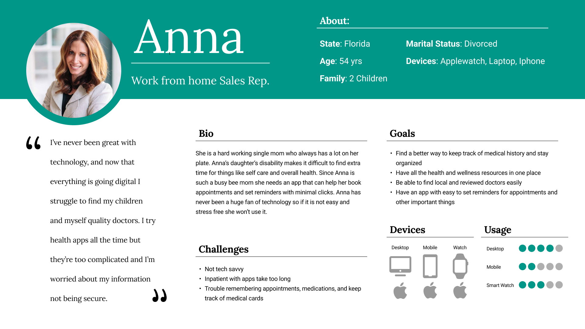
Whole House Health is a responsive web app designed to meet the health and wellness needs of a busy modern family. It provides resources for nutrition, healthcare, and a variety if tools to help users manage their health while balancing day to day life.

This case study focuses on honing in on the problems everyday users face, and how we can improve providing health and wellness resources through a digital product.

The Opportunities Problems Questions

  • Health apps still rank one of the highest downloaded apps in the app store today.
  • Features like booking appointments are rapidly increasing to becoming an online only trend. 
  • Over 60% of online appointments are now booked after hours through an app.
  • Many health apps today will fall to alarming lows of retention after only 1 month.
  • Poor UX/UI design can create confusion and frustration in the booking process causing users to flea.
  • Poor integration with billing, scheduling, and patient portals can cause health providers to opt out of your app. 
  • How can I design a booking process to ease the stress for users and crteate a positive experience?
  • What can I add to my design to create long retention for users and providers?
  • Why are other health and wellness apps failing to deliver a holistic experience for users overall health?

Research

560 Million

total Health app users in 2022

Source:

Bussiness of Apps
See more

37%

Of adults 18 and over, used telemedicine in the past 12 months

Source:

CDC
See more

$35.7 Billion

Total Health app users in 2022

Source:

Bussiness of Apps
See more

90,000

Health apps were released worldwide in 2020

Source:

Insider Intelligence
See more
0 %
Of Users said resources like Meal Prep Guides and Nutrition information would make their lives better.
0 %

Of Users make Doctor appointments with an app.

0 %

Of Users stated that there is not a single app that can meet ALL their health and wellness needs.

My Personas

Created for real people with real problems.

Anna

The hardworking single mom who needs help prioritizing not only her health but her families as well.
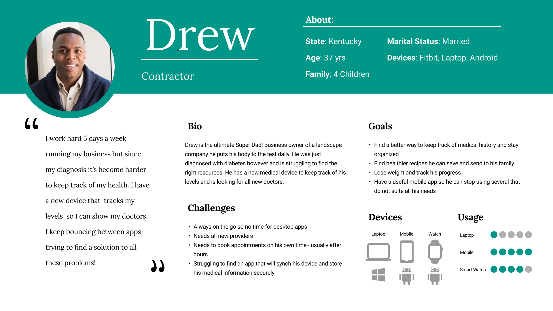
Drew

The ambitious hobbyist who's always on the move. With recent health problems, he could use some extra help.
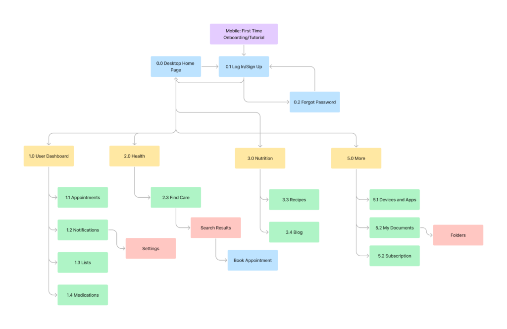
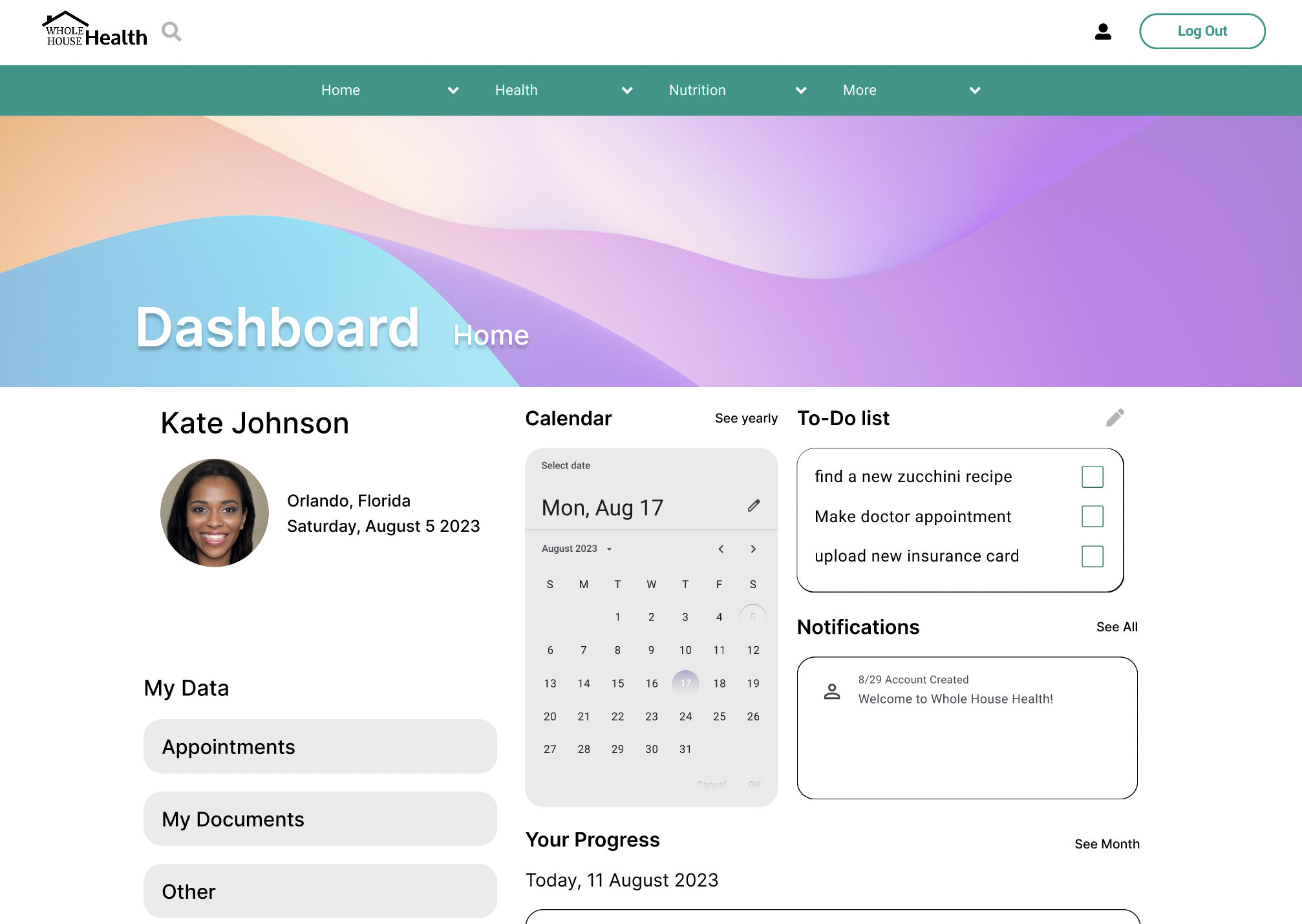
Testing

Key Take Aways and Revisions

Below are examples of key revisions made throughout the testing process. Interviews, market research, collaboration with mentors and colleagues, are a few of the contributing elements to the newest iterations of my design.

Participants

  • Ages 32-67
  • Family size 2-6
  • Occupations from home-maker to full timers

Methodology

  • Live Moderated Usability Tests
  • 20-30 minutes sessions
  •  Participants went through the app mobile and desktop completing a set of tasks involving core features

Questions

  • Will my participants understand the apps purpose from initial response?
  • Can the average user navigate my prototype successfully and complete the tasks assigned?

Results - Top 3 Revisions

Based off of the Jakob Neilson Scale the following were the highest needed revisions:

  • Relocating the Documents tab
  • Increasing Accessibility for a better visual experience
  • Improving details in the booking process
  • Improving the search filters for providers and nutrition

Results that Drove Major Improvements

Dashboard V1

The original dashboard included a calendar, progress trackers as well as the "My Documents" section.
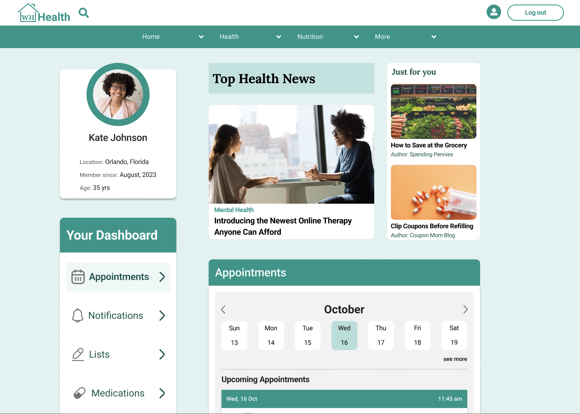
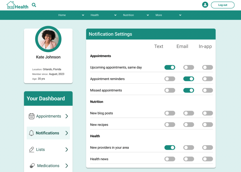
Dashboard V2

After usability testing and colleague feedback I changed the location of My Documents, and made major revisions to: Appointments, Lists, Notifications and more.
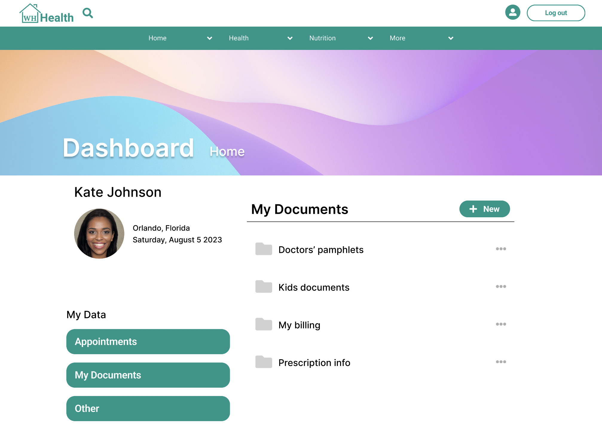
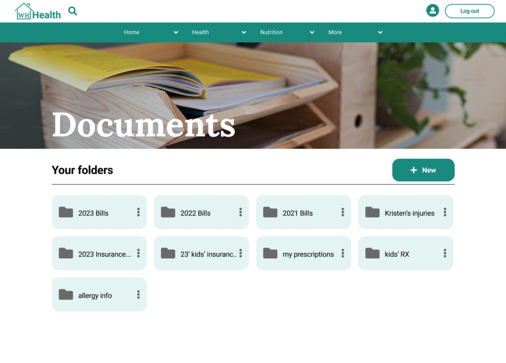
Documents V1

Originally housed within the dashboard, this feature gives users the ability to upload medical documents and information within.a secure drive.
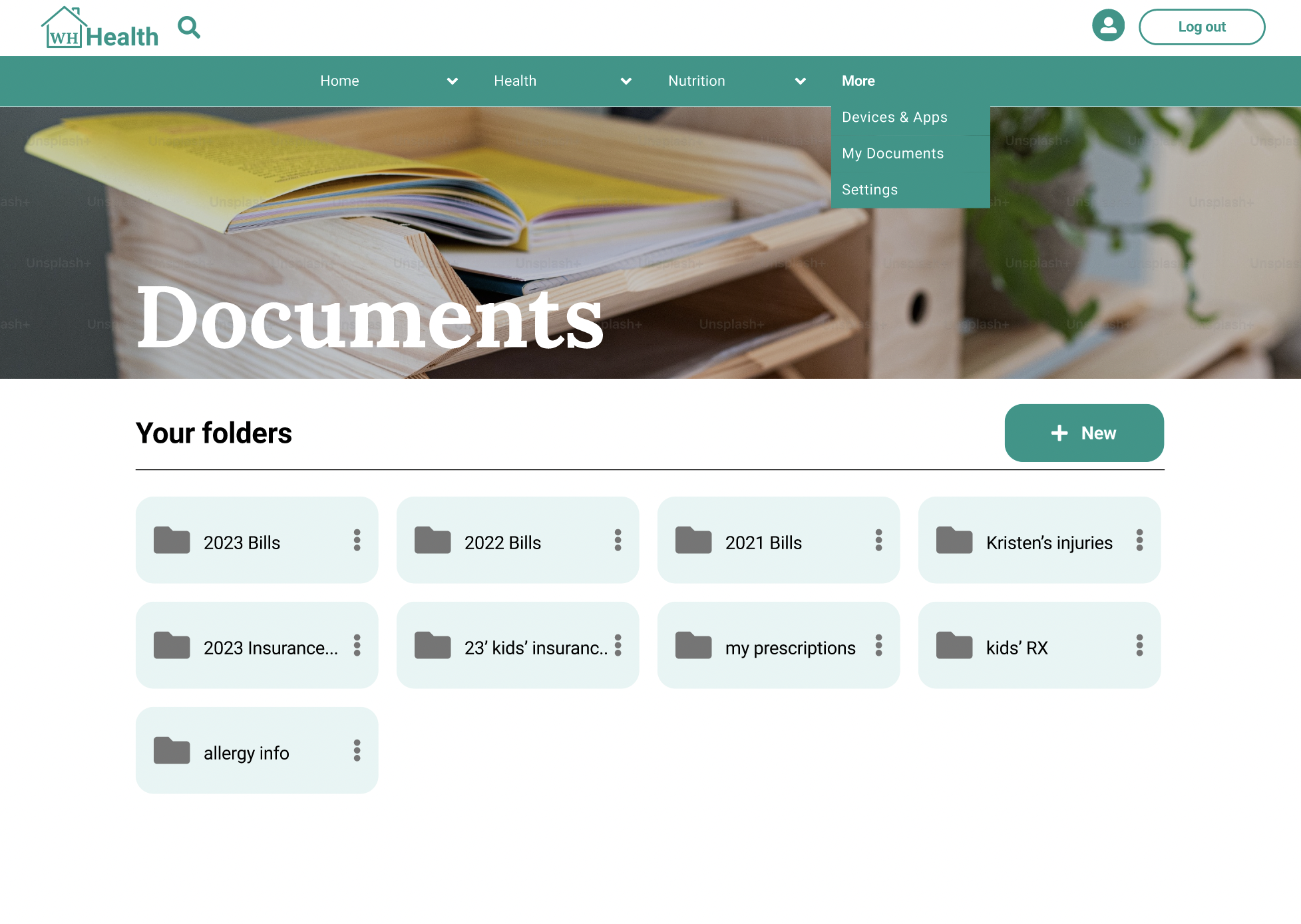
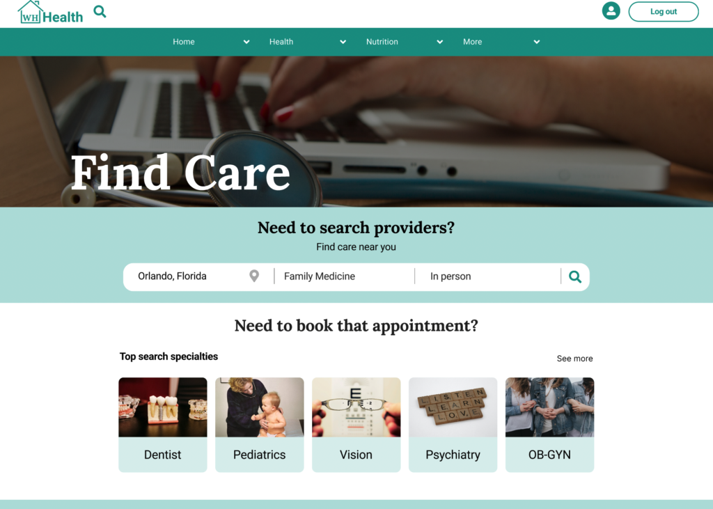
Documents V2

Now moved to the "More" tab, this feature meets Google Material Design standards, follows the grid layout amongst other improvements.

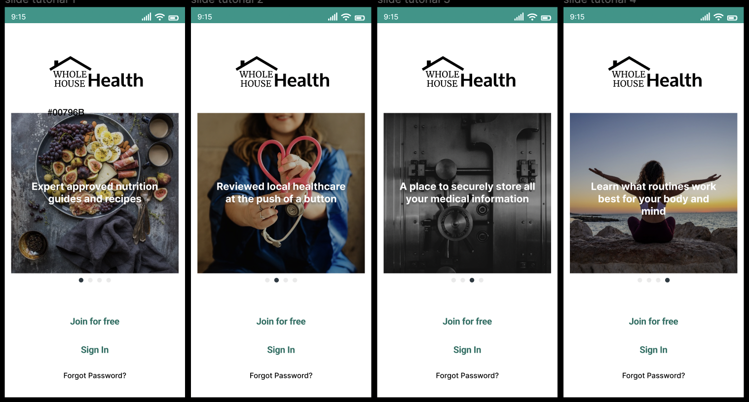
Mobile Splash Screen V1

This basic slide tutorial was intended to grab the users attention and inform them about the apps features.

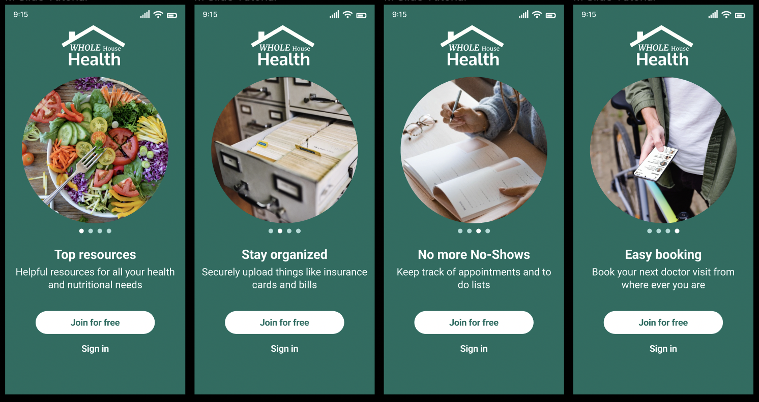
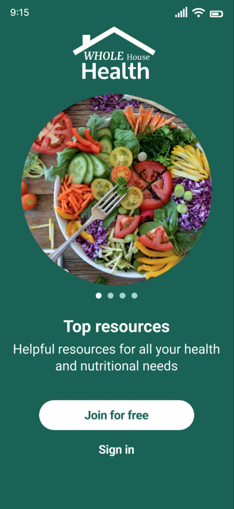
Mobile Splash Screen V2

Early on my participants expressed the satisfaction in the prototypes animated interactions. However, V1's design gave an unclear message of the apps mission and features. With colleague feedback and testing this new design offers clarity and engagement.

Solutions

Each feature’s revisions were driven by data throughout the case study. The features below have been updated after gaining valuable participant feedback in usability and A/B testing, while maintaining the business and original user goals in mind.

Booking an Appointment

With more than 60% of doctors appointments being booked after office hours, creating a smooth, easy to use and engaging booking process was vital. Using specifically chosen search fields, users can book an appointment with a vetted, local provider in 15 clicks or less, and receive text and or email confirmation based off of their chosen settings.


Interactive Homepage

The hook, the attention grabber, the part of an app that makes the user want to commit. Key interactions combined with valuable information play together on the homepage in unison. 

Uploading Documents

During testing, 80% of participants expressed the interest and relief of having an app that can safely store medical information, history, and more, securely in one place. This feature allows users to have peace of mind and stay organized with documents like insurance cards, bills, prescription information and more.

Design Language

				
					<!DOCTYPE html>
<html>
<head>
	<meta charset="utf-8">
	<meta name="viewport" content="width=device-width, initial-scale=1">
	<title>Healthapp Webpage</title>
	<link rel="stylesheet" type="text/css" href="style/style.css">
</head>
<body class="background">
	<h1 id="title">Whole House Health Preview</h1>
<div class="body-wrapper">
	<p style="font-size: 16px;" 
	class="bodyText margin-bottom">With Whole House Health, users can find <b>reviewed</b> and <b>local healthcare providers</b> with minimal clicks on desktop or mobile.</p>
	<p class="bodyText">This is an example of searching for a new doctor and booking an appointment.</p>
	<img decoding="async" src="assets/images/Find Care Page Desktop.png" alt="Find Care Desktop Screenshot"
	style="max-width: 70%;height: auto;border-style: solid;border-color: black;border-width: 2px;margin-left: 80px; margin-bottom: 40px; box-shadow: 8px 8px lightgrey;">
</div>
<br/>
<br/>
<br/>
</body>
</html>


Notification Settings:

After participant feedback and testing this page was created to give users the freedom to choose notifications for receiving text and or email updates such as appointments or new information published to the app.

Find Providers:

After collaborating with colleagues, and usability testing I optimized how users choose a provider. “Distance” information was added, and also better accessibility for visually impaired users with padding and updated UI styling elements.

Find Care Search

On mobile and desktop users have three main search filters to find care. Due to the growing popularity of virtual visits, this search field was added after research and user testing.

Mobile Spalsh Screen:

After feedback and testing, I listened to colleagues, and greatly improved the slide tutorial page for mobile. 

With greater accessibility, the information conveys to every type of use what exact products the app has to offer.

Documents Page

On mobile and desktop users have the ability to upload medical and health related documents securely.  

After studying Google Material Design and leading drive applications I re-designed this page for improved usability.