Over the years of creating art it has been exciting to see my style evolve.
My biggest goals when creating a new piece is marrying function and beauty. Recieving customer feedback from all over the country has been a motivating and rewarding experience that drives me to continue to push my boundaries as an artist.
Students have learned basic to intermediate hand building techniques since the start of the school year. We first began learning hand building methods such as pinch pots, coil building, and later more advanced slab building. Half-way through the nine weeks students were introduced to sculpture. Students can now demonstrate how to accurately create multiple types of forms through these various techniques and are able to explain to the process from beginning to end result.

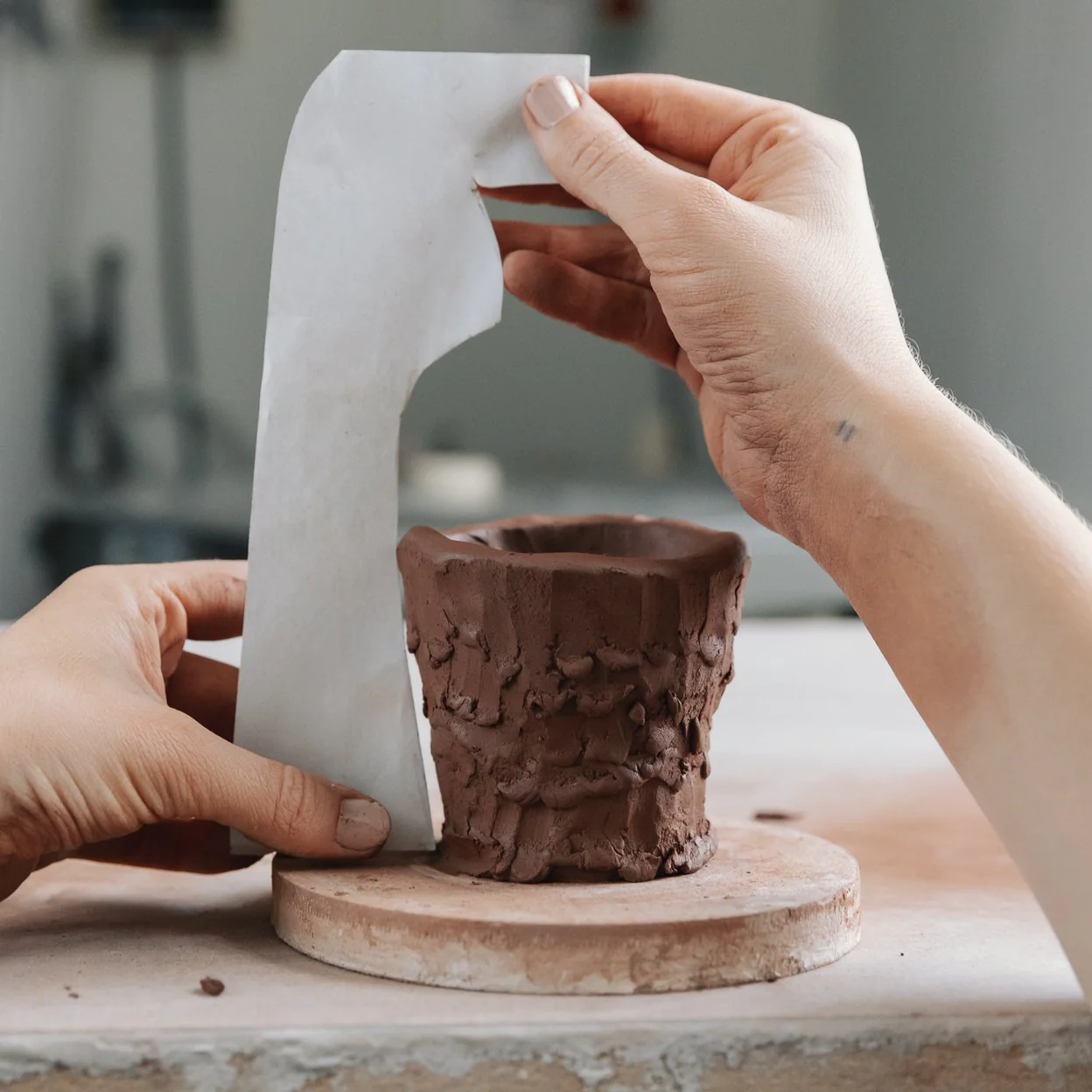

Students learned how to enhance their ceramic forms using surface decoration techniques such as stamping, incising, impressing, and applying textures. They explored how surface treatment can add visual interest and convey meaning, while also learning about underglazing, sgraffito, and basic glaze application. This topic encourages students to connect surface with form and develop personal style and storytelling through texture. The focus also included proper application and timing for decorative techniques in the greenware and bisqueware stages.
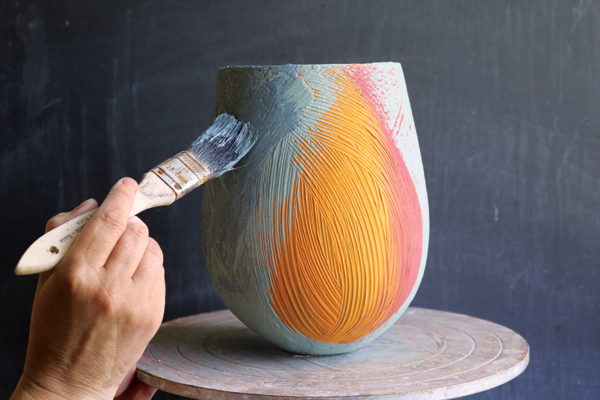
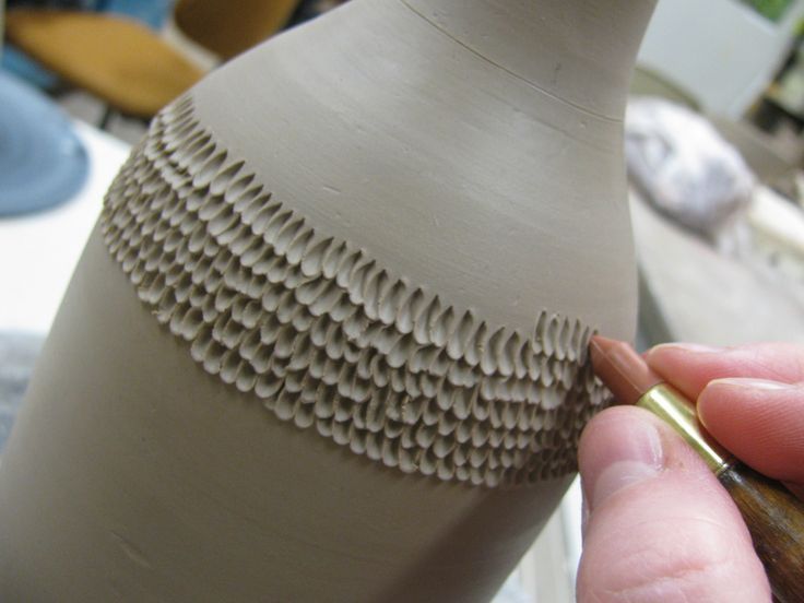
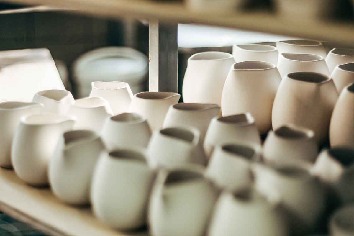
Students studied the different stages of clay—slip, plastic, leather-hard, bone-dry, greenware, bisqueware, and glazeware. They learned to identify each stage by its physical characteristics and understand how timing affects the construction and decoration of ceramic work. The topic also covered the kiln firing process, including safety procedures, the bisque firing, and glaze firing cycles. Emphasis was placed on proper studio habits and clay care to avoid issues such as cracking or exploding in the kiln.
Students will be introduced to the pottery wheel through basic centering, opening, and pulling techniques to create simple cylindrical forms like cups or small bowls. They will explore how working on the wheel differs from hand-building in terms of control, speed, and symmetry. The unit will emphasize practice and patience, allowing students to become comfortable with the physical rhythm and coordination required. Students will also reflect on how form and function interact in wheel-thrown ceramics.

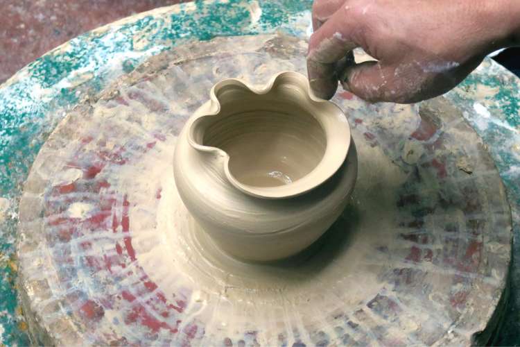
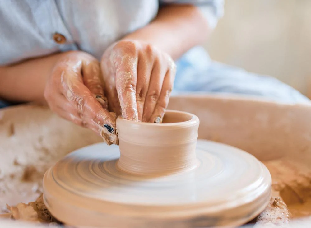
Students will explore the various ways to finish a ceramic piece through the use of glazes, wax resist, oxide washes, and decorative layering. They will learn how glaze chemistry affects color, texture, and surface and how to properly apply glaze to ensure a successful final product. Safety and cleanliness during glazing will be emphasized to prevent cross-contamination and kiln mishaps. This unit encourages experimentation within guidelines and builds an understanding of cause-and-effect in the ceramic process.
VA.912.S.2.1
Organize the content of personal artwork to achieve visual unity and communicate intent.


Students will be introduced to the pottery wheel through basic centering, opening, and pulling techniques to create simple cylindrical forms like cups or small bowls. They will explore how working on the wheel differs from hand-building in terms of control, speed, and symmetry. The unit will emphasize practice and patience, allowing students to become comfortable with the physical rhythm and coordination required. Students will also reflect on how form and function interact in wheel-thrown ceramics.


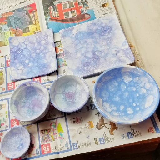
Students will explore the various ways to finish a ceramic piece through the use of glazes, wax resist, oxide washes, and decorative layering. They will learn how glaze chemistry affects color, texture, and surface and how to properly apply glaze to ensure a successful final product. Safety and cleanliness during glazing will be emphasized to prevent cross-contamination and kiln mishaps. This unit encourages experimentation within guidelines and builds an understanding of cause-and-effect in the ceramic process.
VA.912.S.2.1
Organize the content of personal artwork to achieve visual unity and communicate intent.


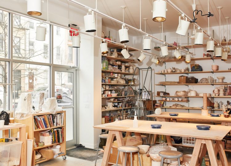
I’m excited to announce an upcoming field trip to a local pottery studio: Artistic Hands, where students will get a behind-the-scenes look at the professional world of ceramics. During the visit, students will tour the studio, observe live wheel-throwing demonstrations, and engage with working ceramic artists to learn about their techniques, inspirations, and career paths. This hands-on experience will deepen their understanding of the ceramic process beyond the classroom and show real-world applications of what we’re learning. It’s a fantastic opportunity to inspire creativity, ask questions, and see art in action!
More details will be emailed to parents soon.
Date: 10/25/25
Time: 8:25 – 2:00
Students should arrive properly at school and meet in our classroom by 8:25 A.M.
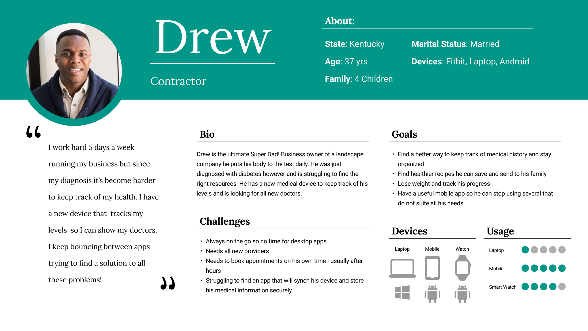
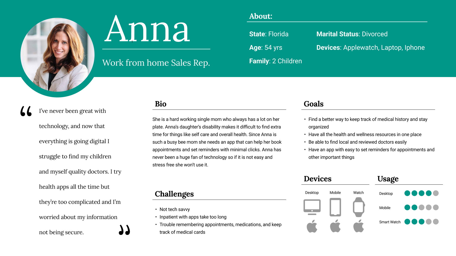
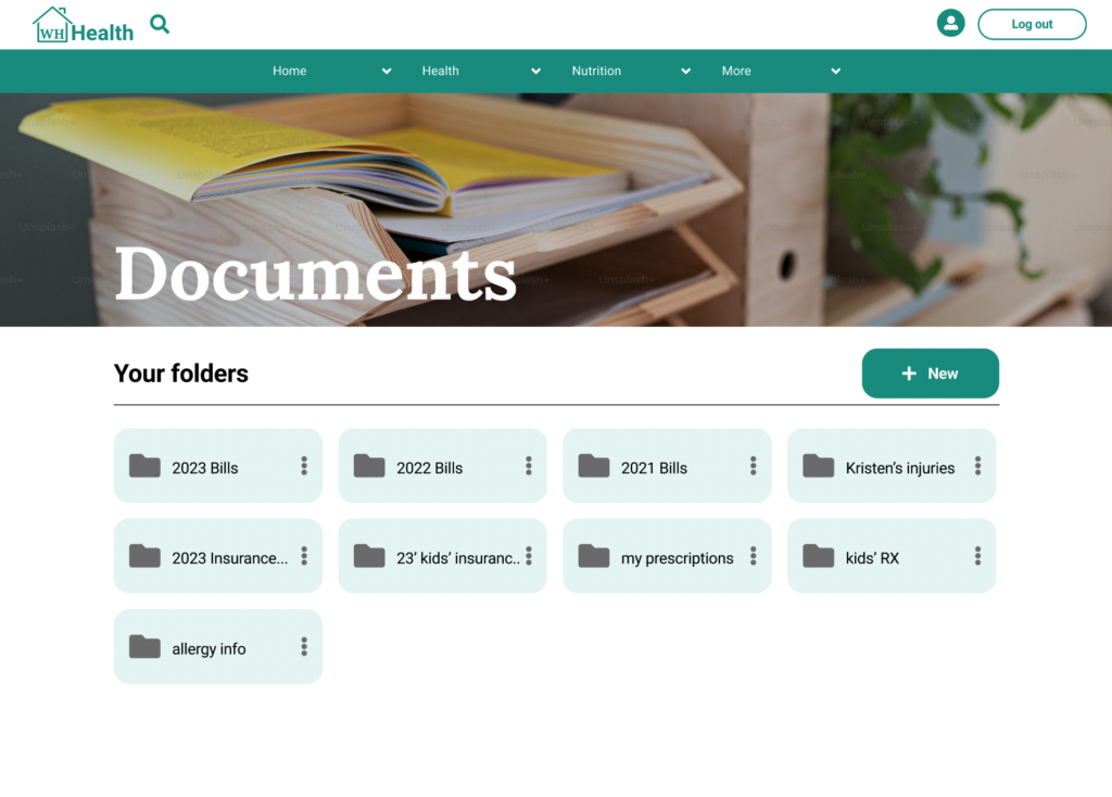
On mobile and desktop users have the ability to upload medical and health related documents securely.
After studying Google Material Design and leading drive applications I re-designed this page for improved usability.
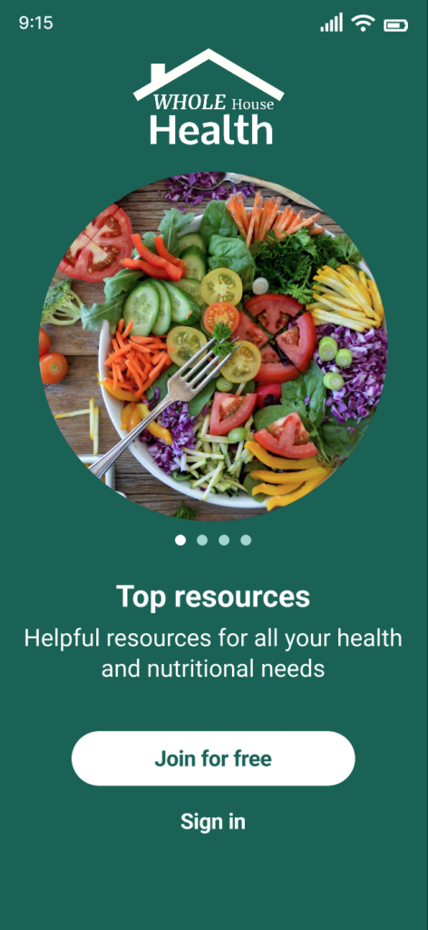
After feedback and testing, I listened to colleagues, and greatly improved the slide tutorial page for mobile.
With greater accessibility, the information conveys to every type of use what exact products the app has to offer.
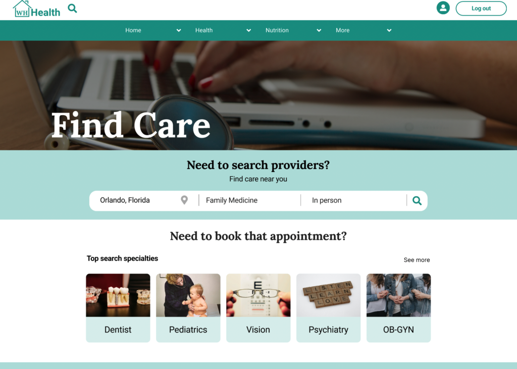
On mobile and desktop users have three main search filters to find care. Due to the growing popularity of virtual visits, this search field was added after research and user testing.
After collaborating with colleagues, and usability testing I optimized how users choose a provider. “Distance” information was added, and also better accessibility for visually impaired users with padding and updated UI styling elements.

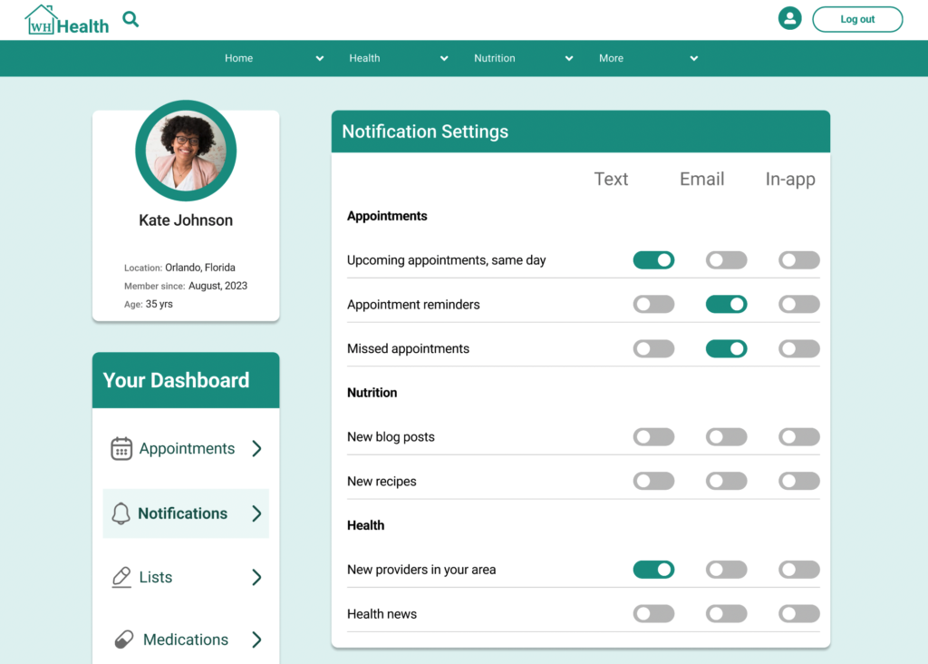
After participant feedback and testing this page was created to give users the freedom to choose notifications for receiving text and or email updates such as appointments or new information published to the app.