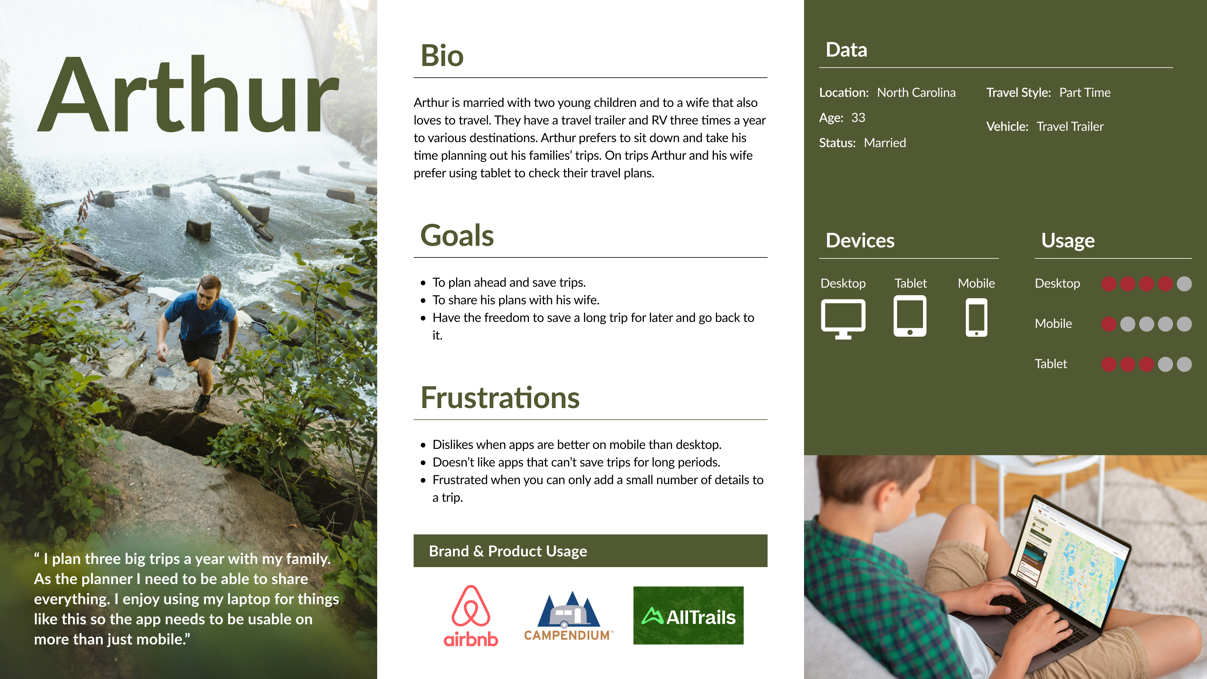
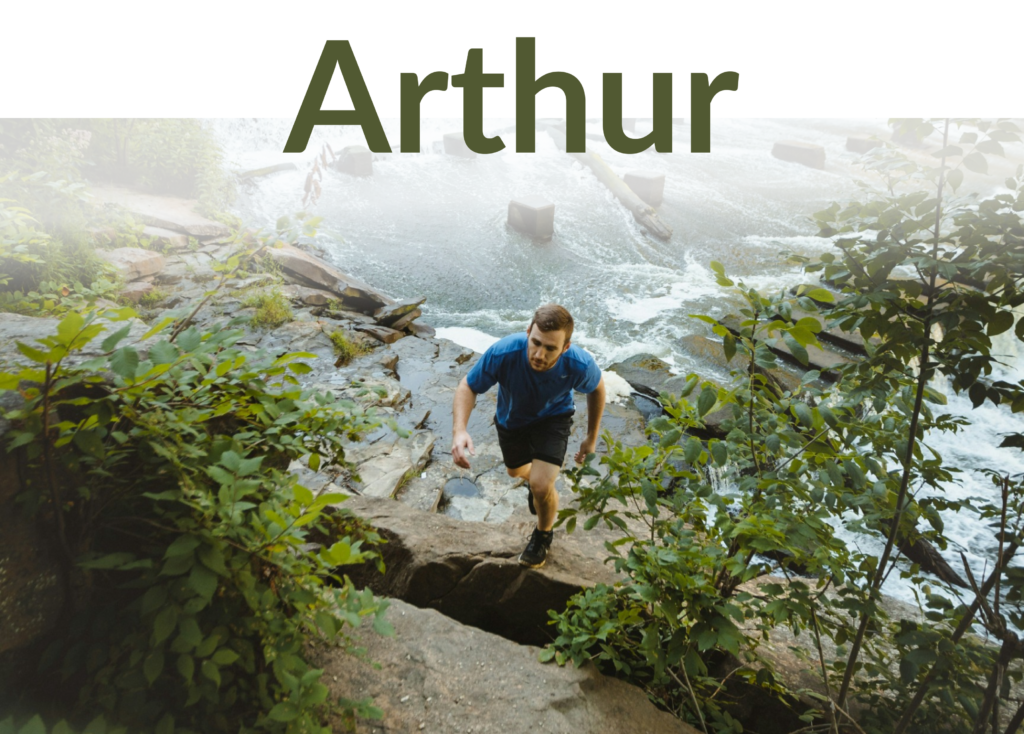
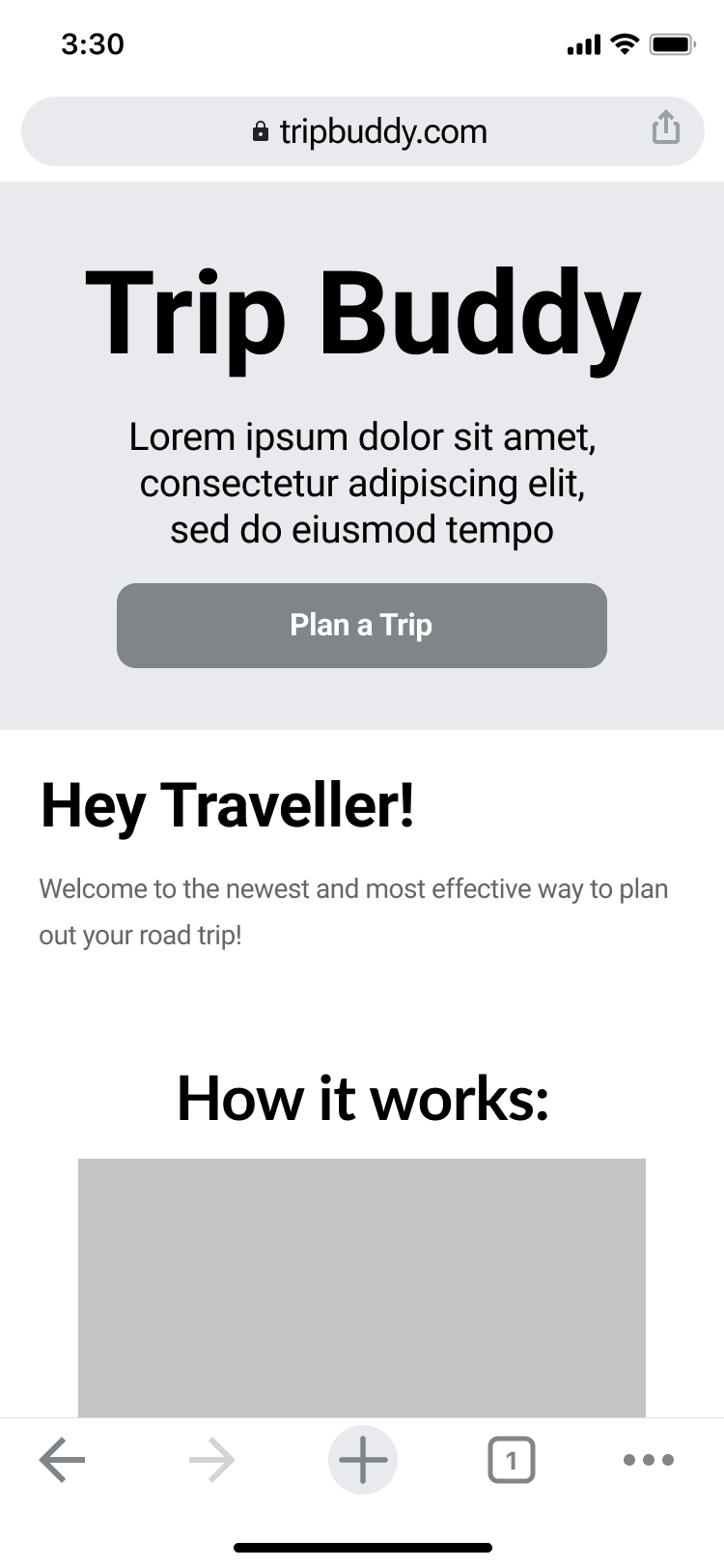
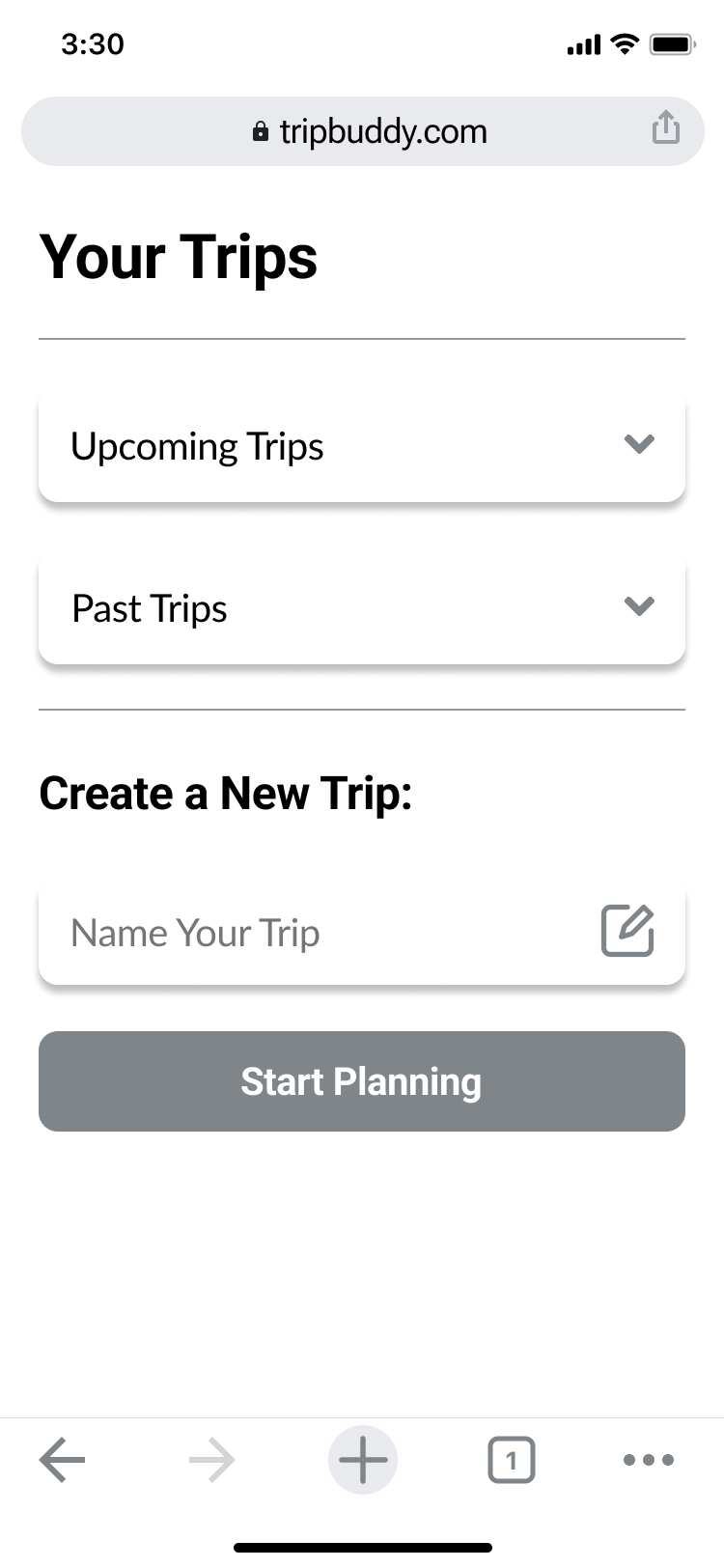
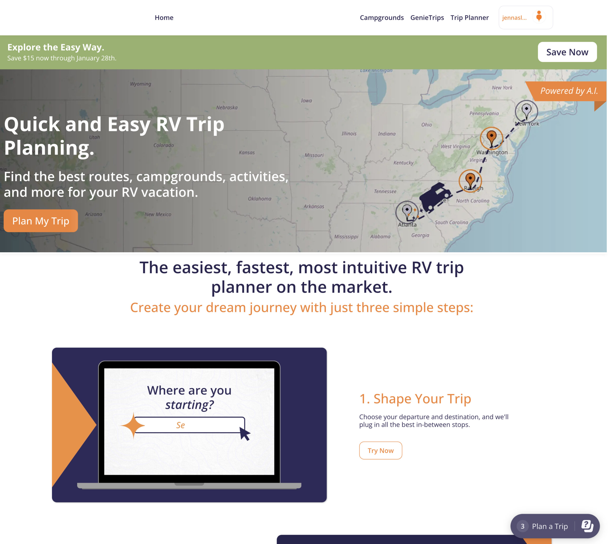
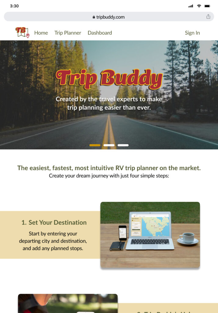
Trip Buddy is my redesign of a newly created RV trip planning app. The scope of this project was to identify the most critical pain points users had using the original app and improve the overall usability while also executing a full UI redesign. Conducting interviews, preference and usability testing I was able to clearly determine the key problems to improve.

The Problem

A new travel enthusiast needs an app to help plan and route her trips, edit them later, and then share them with friends and family.

How can we design a booking app that will let her add all the necessary pieces of trip planning while still be accessible to not only her but the people she will share it with?

My Personas

After gathering market and participant data, I took careful consideration designing these personas. Their goals, challenges, travel style and more, all contribute to narrowing the scope for app improvements.

A young full time traveller with a pet. She’s the user that needs a mobile app with high accessibility for her vision. Needs the app to work quickly and with ease, as she is always on the go.

A working dad in charge of planning his family trips. He likes to take his time using desktop applications and have the ability to save, edit and later share his plans.

Design Process

Trip Buddy began first by researching the necessity for travel planning apps and the needs of their audience. After creating the redesign, finishing the prototype in mobile and mockups of larger devices, several important screens and rounds of testing were completed, followed by implementing the revisions into a better quality app. 

Key Take Aways and Revisions

Re-creating the site map allowed for me to pin point the exact pieces of the flow that users struggled with. Each pain point was a source of working torwards the solution.

Participants

  • Ages 35-58
  • Family size 0-4
  • Travel Styles considered:
    • Full time off and on
    • > 5 trips annually
    • < 8 trips annually

Methodology

  • Live Moderated Usability Tests
  • A/B Preference tests
  • 20-30 minutes sessions
  •  Participants completed the desktop prototype and viewed a shortened version of the Tablet and Desktop feature

Questions

  • Will my participants understand the apps purpose from initial response?
  • Can the users navigate my prototype successfully and complete the trip booking process?
  • What elements of the design will cause confusion or frustration during testing?

Results: Top 3 Revisions

  • Improving the information on the landing page.
  • Increasing Accessibility for a better visual experience.
  • Improving details of content given for Stays, and Points of Interest
  • Using content such as images more deliberately and human centered.

Improvements

These improvements were from the early redesign stages. The beginning sequence of this project involved a deep analysis of the original app I chose to reshape.

Each feature below was a target for user frustrations, later turned into an improvement.

Original Homepage

This original homepage lacked a human centered design many popular apps in the industry use. Though the branding and pallet were consistent it appeared "dated".
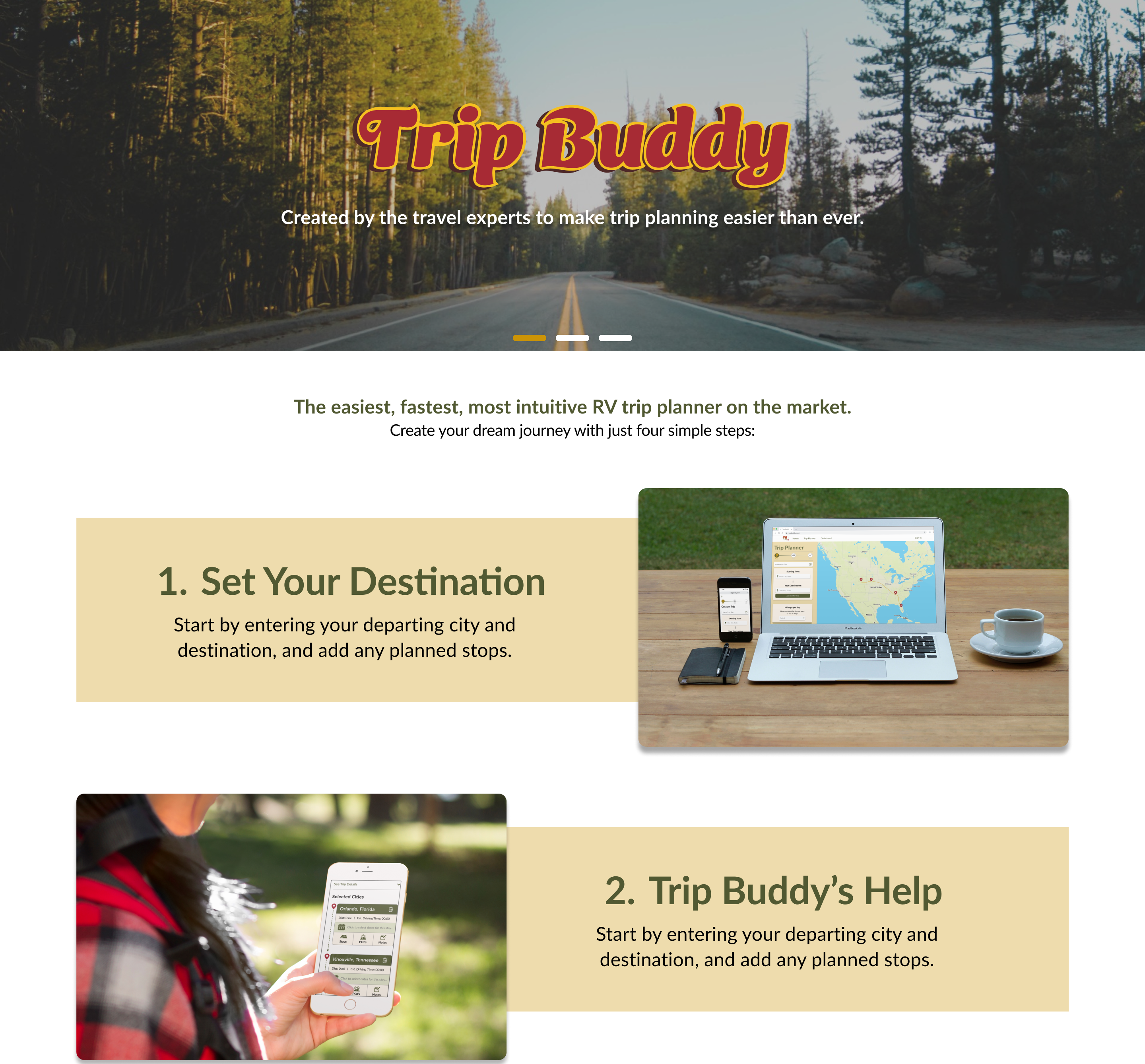
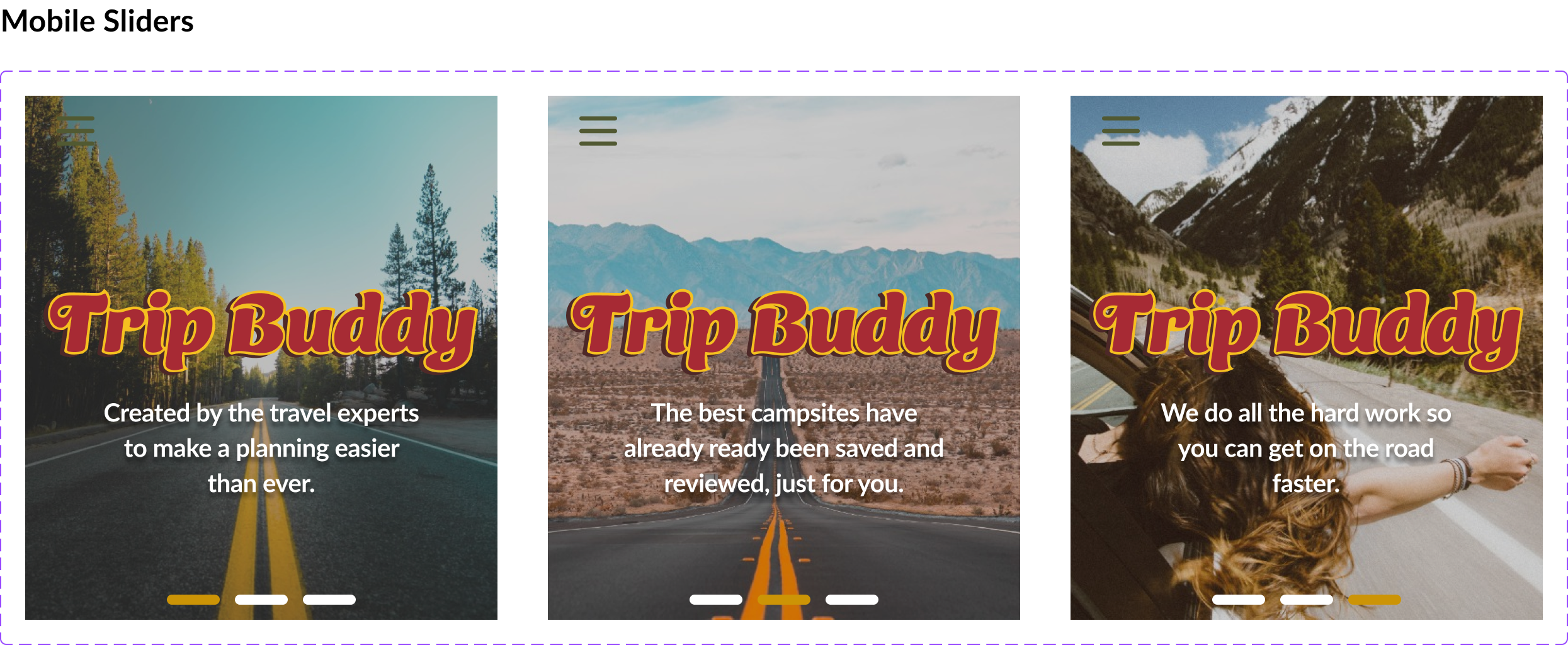
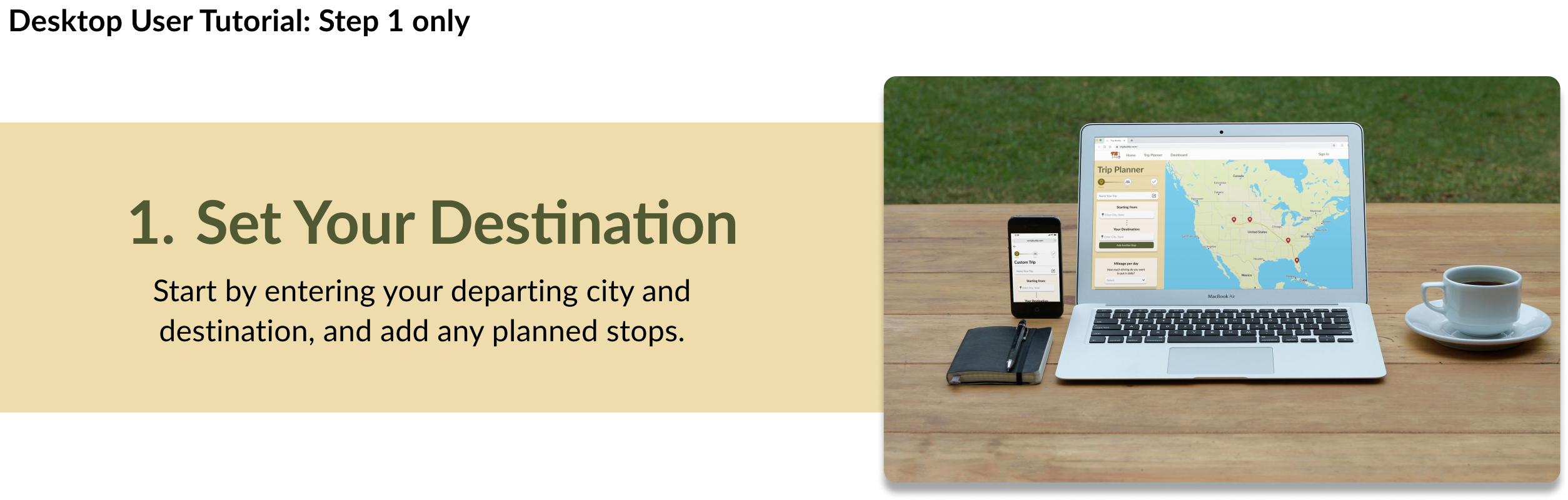
Redesign

Improvements include more contrast and definition of the steps for users, an updating style and branding. More human centered imagery in the tutorial, reviews and more.

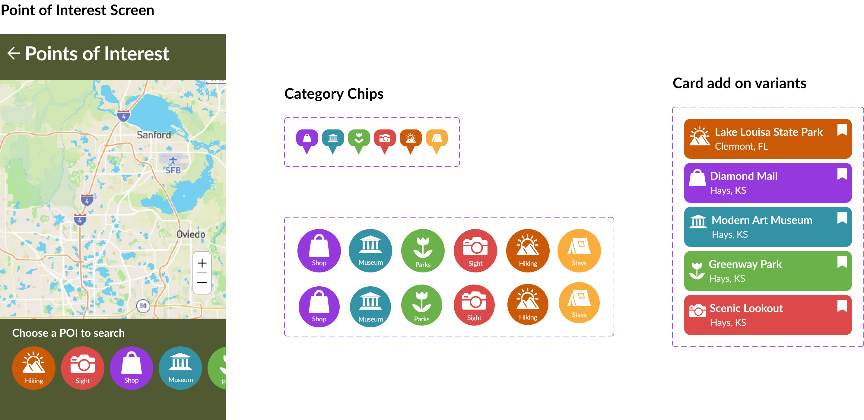
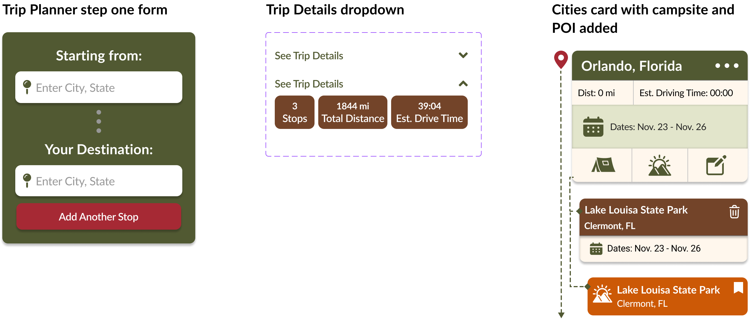
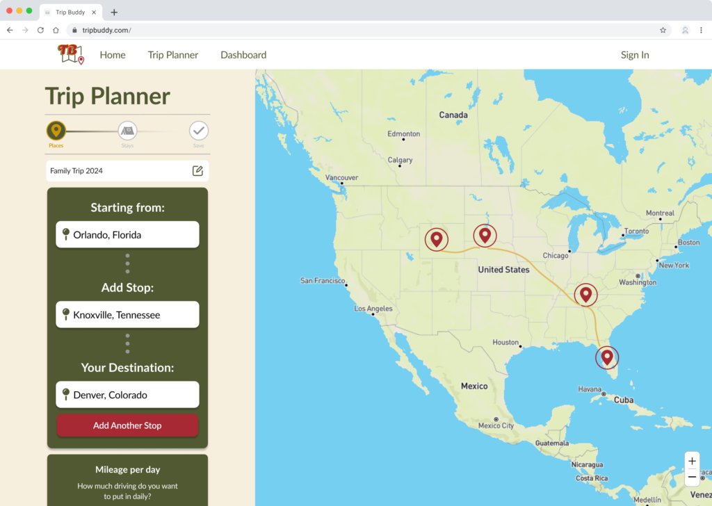
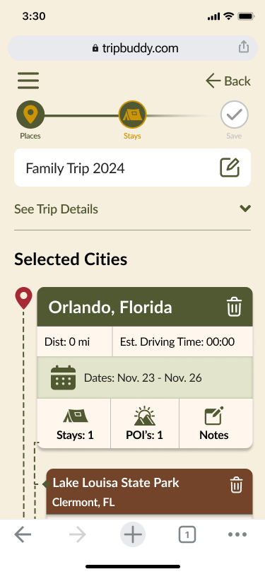
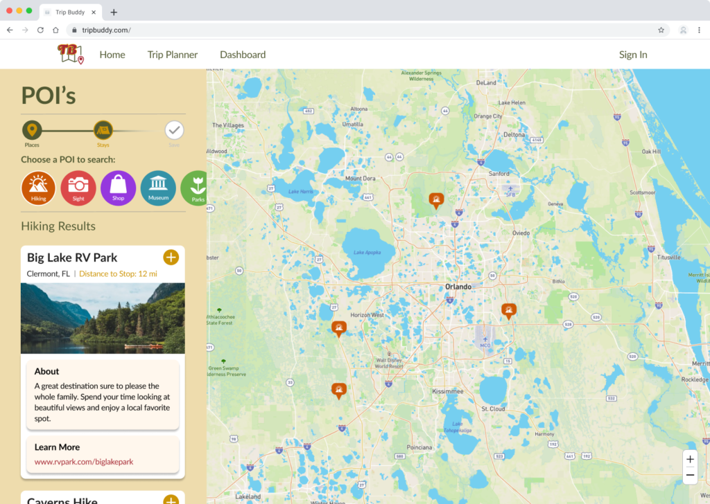
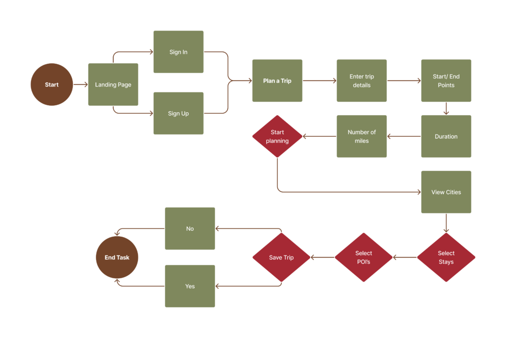
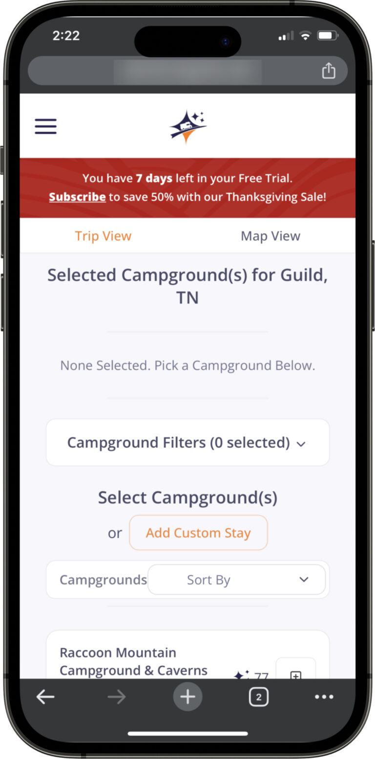
Original Trip Planner

Cards and background lack contrast. The colors made it difficult to determine the organization. Icons size and placement was not accessible.
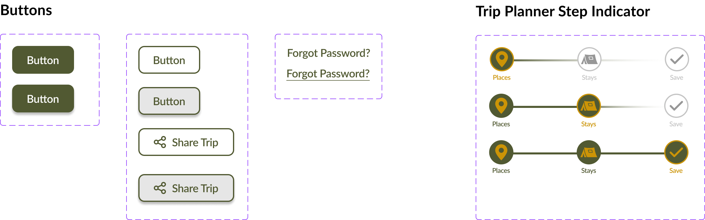
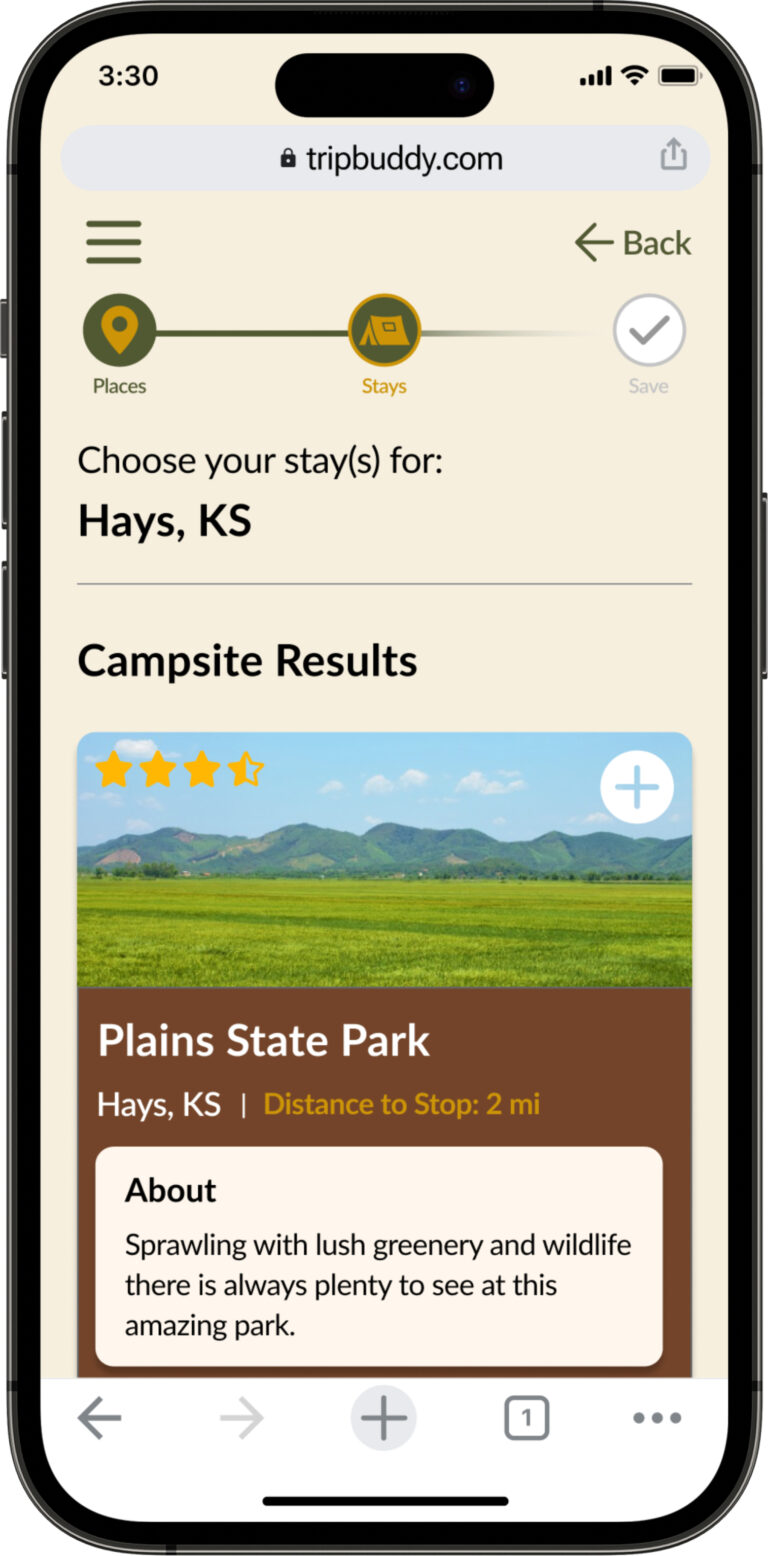
Redesign

A step indicator created. Cards have greater contrast. Icons are larger for better accessibility.

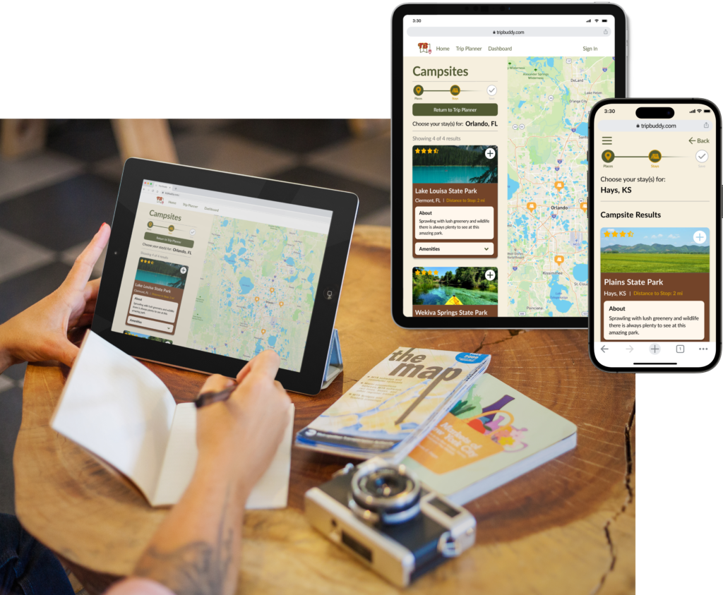
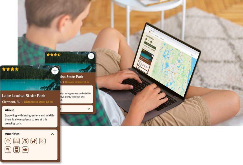
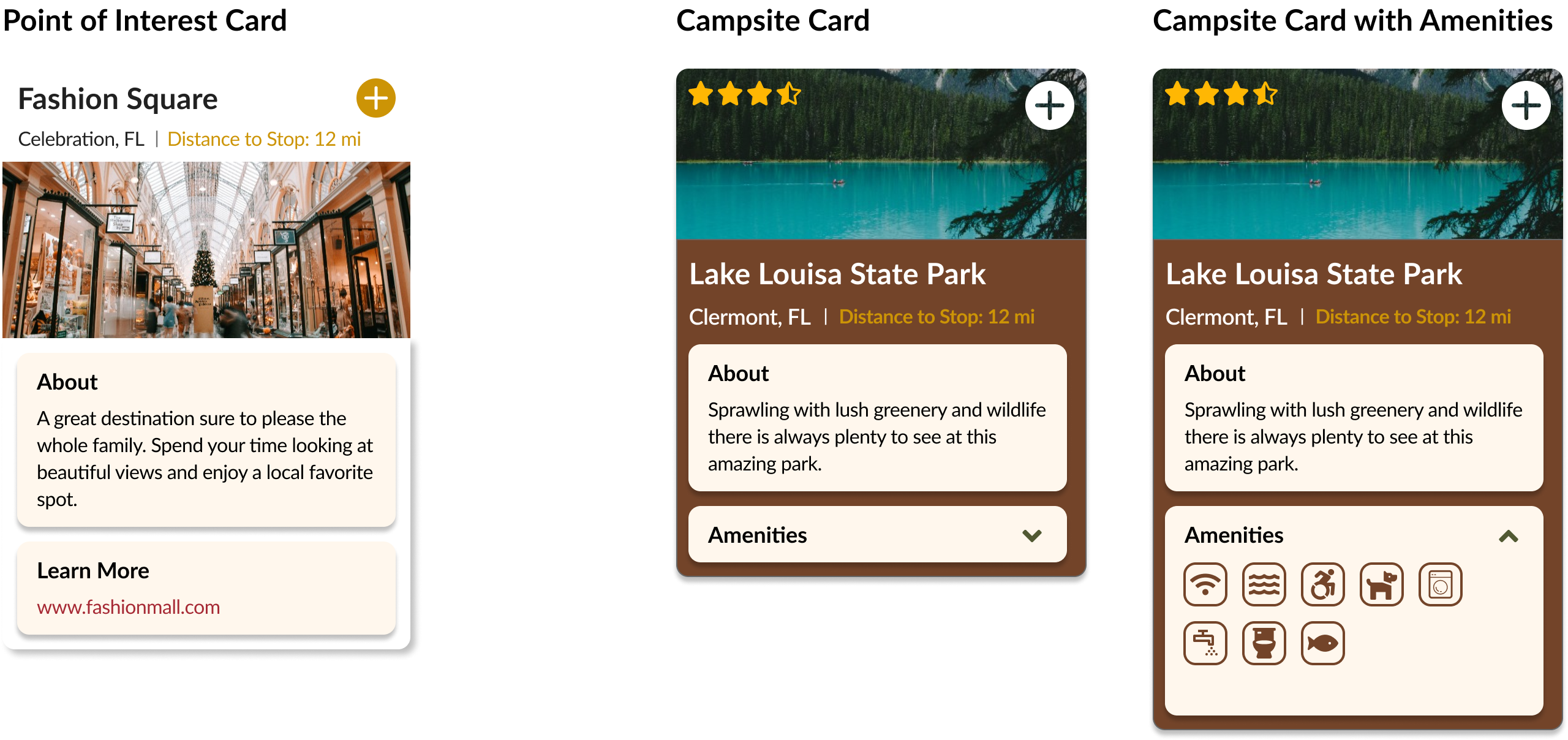
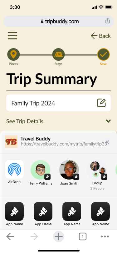
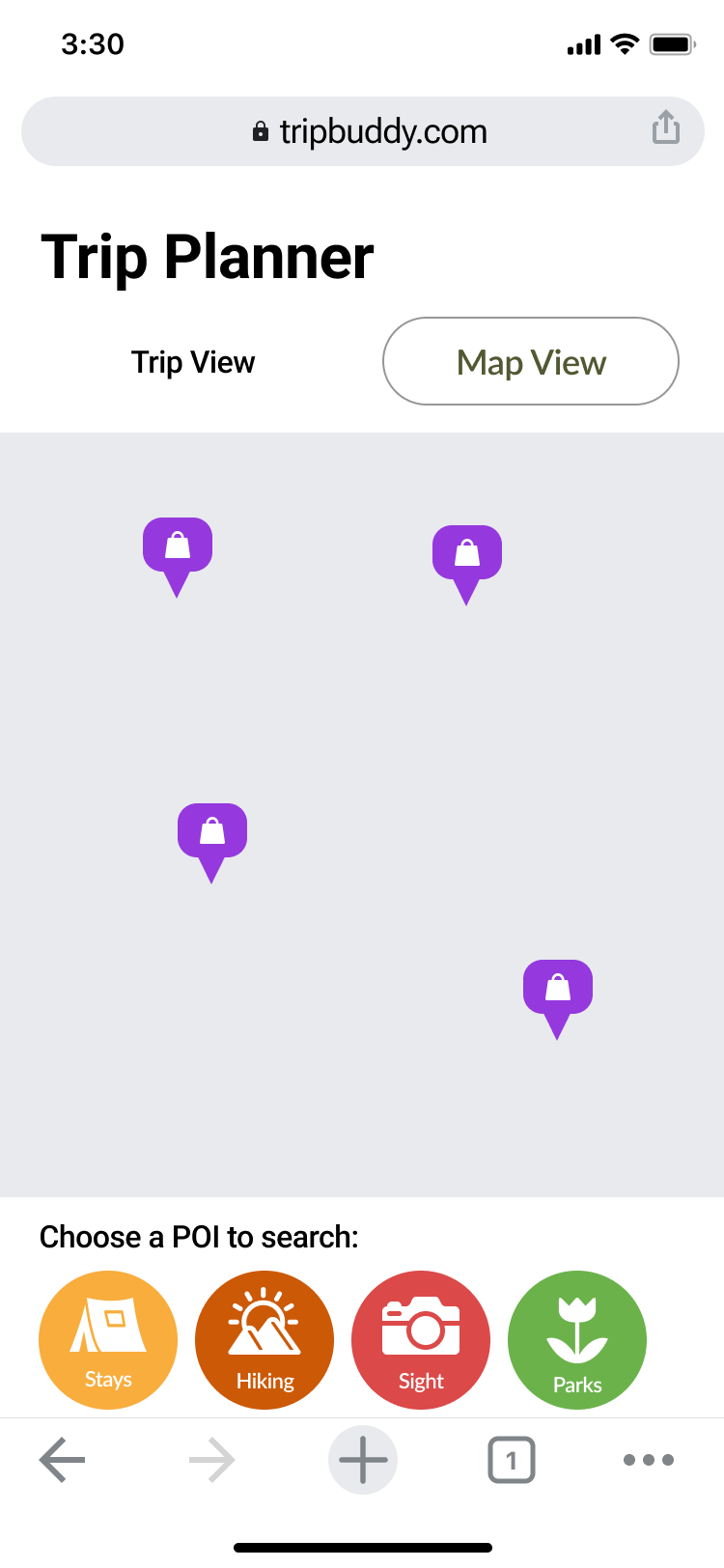
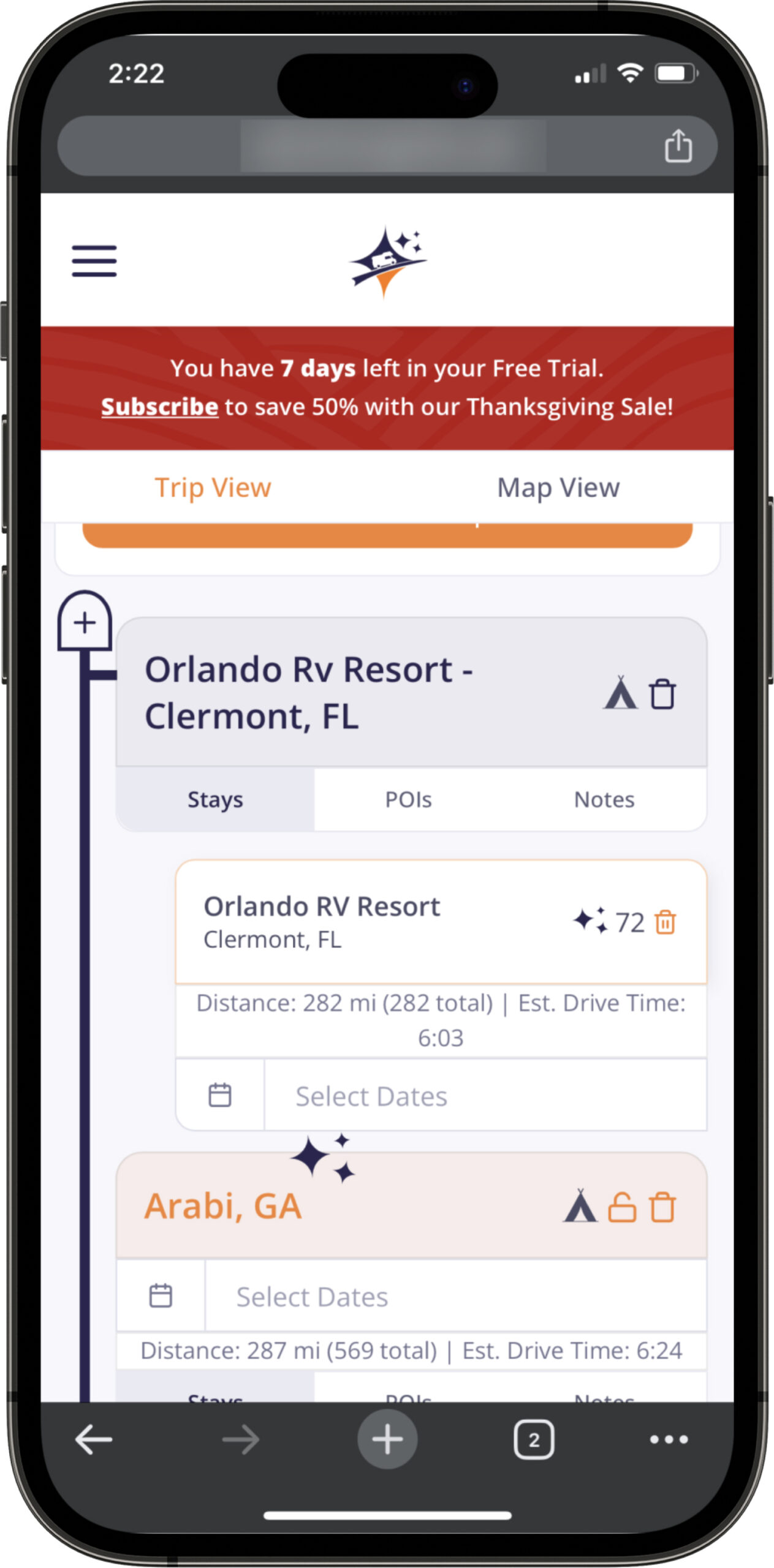
Original Campsite View

Contrast is very low. Campsite cards do not offer any preview to the user. Text is overall too small.
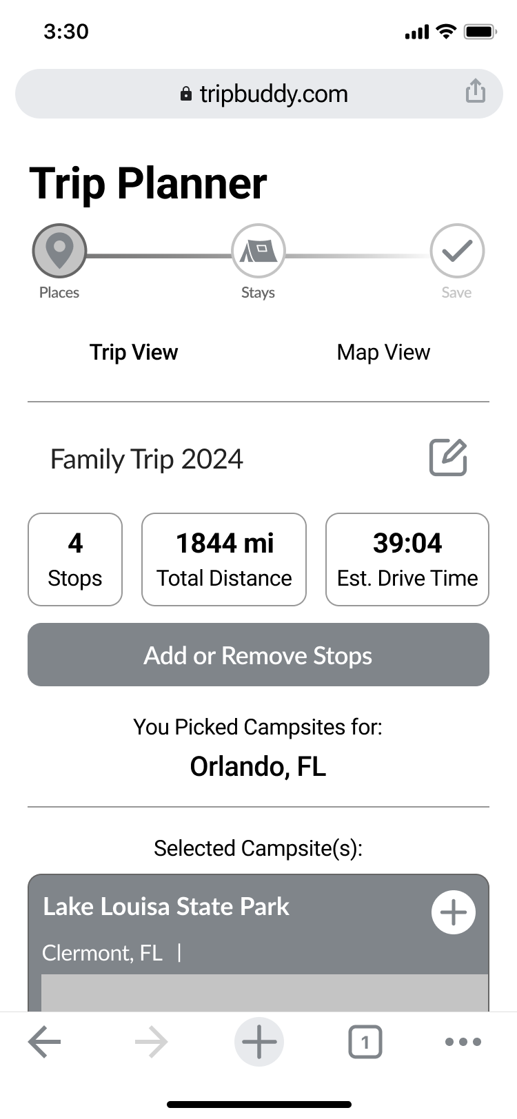
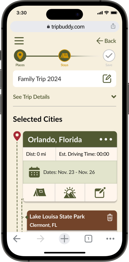
Redesign

Larger text, greater contrast, and cards offering a preview to the user with more information.

Solutions

After gaining valuable feedback from usability and A/B testing  the following solutions were implemented into my design. As I continued to test and iterate after each round of feedback or data, I maintained the business and original user goals in mind.

Brand Strong, Approachable Style

Across devices minor changes will not hinder the user from finding the information needed or completing tasks. Keeping in mind the wide range of device usage within the audience consistency across breakpoints was significant.

Saving and Sharing

A necessary feature that user participants expressed as a need. This design is based off of other popular apps within the industry to provide a smooth familar process to users.

Components & Consistency

This “Campsite Card” is an example of improving on the original design as well as the functional use of components and variations within the prototype.

Style Guide

Staying organized was key during this redesign. Having time based goals for a prototype meant maintaining a consistent library of all my UI elements.

The Prototype

View the mobile task flow here in FIGMA.

Landing Page

On every device users are guided with a tutorial that is human centered and informative.  

After studying Google Material Design and popular apps in the same fields I re-designed this page for improved usability.

Trip Planner Page

On all devices users are able to input their destinations, add stops and input their daily mileage.

Tablet and desktop breakpoints offer an interactive map and will populate the cities and route.

Trip & City View

After user testing and analyzing the original design it was key to increase the contrast of this page. 

Now users can easily see the cities, with more defined cards and information as they continue to add things like stays and points of interest.

Points of Interest

On tablet and desktop, users can view a more accessible card of information to help them select a point of interest. Each category corresponds with chip matching icons, an improvement from the original version.

Save & Share

Based off participant data expressing the need for this feature, users can now share their trip with friends and family.

Documents Page

On mobile and desktop users have the ability to upload medical and health related documents securely.  

After studying Google Material Design and leading drive applications I re-designed this page for improved usability.

Mobile Spalsh Screen:

After feedback and testing, I listened to colleagues, and greatly improved the slide tutorial page for mobile. 

With greater accessibility, the information conveys to every type of use what exact products the app has to offer.

Find Care Search

On mobile and desktop users have three main search filters to find care. Due to the growing popularity of virtual visits, this search field was added after research and user testing.

Find Providers:

After collaborating with colleagues, and usability testing I optimized how users choose a provider. “Distance” information was added, and also better accessibility for visually impaired users with padding and updated UI styling elements.

Notification Settings:

After participant feedback and testing this page was created to give users the freedom to choose notifications for receiving text and or email updates such as appointments or new information published to the app.