Lingo Lympics is a mobile learning app designed to meet the needs of competitive, social learners that desire or need to learn a new language. Inspired by the data of market leading apps such as Strava and Duolingo, this app was tested by users of the same market and learning style.

This case study transforms the problems users face learning a new language and turns them into solutions.

The Problem

A young career driven user needs an app to satisfy his competitive attitude so he can learn a new language. After past learning apps leading him to boredom and feeling isolated, he wants something that will stimulate his need to learn again.

How can we design a learning app that fits into his busy schedule, motivates him to keep learning, and connects him socially?

Research

500 Million

registered users.

Duolingo

"Launched in 2012 in the US, Duolingo is the most popular app to learn a new language"
Read more

1.8 Billion

activities published.

STRAVA

"The competition element has become the key factor drawing users back to the app...Strava had 95 million registered users, with two million added every month."
Read more

200 Million

registered users worldwide.
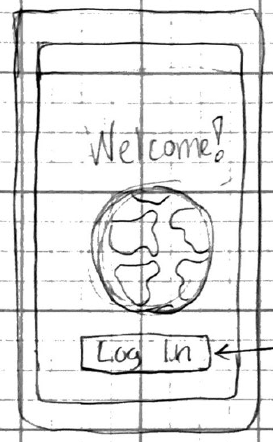
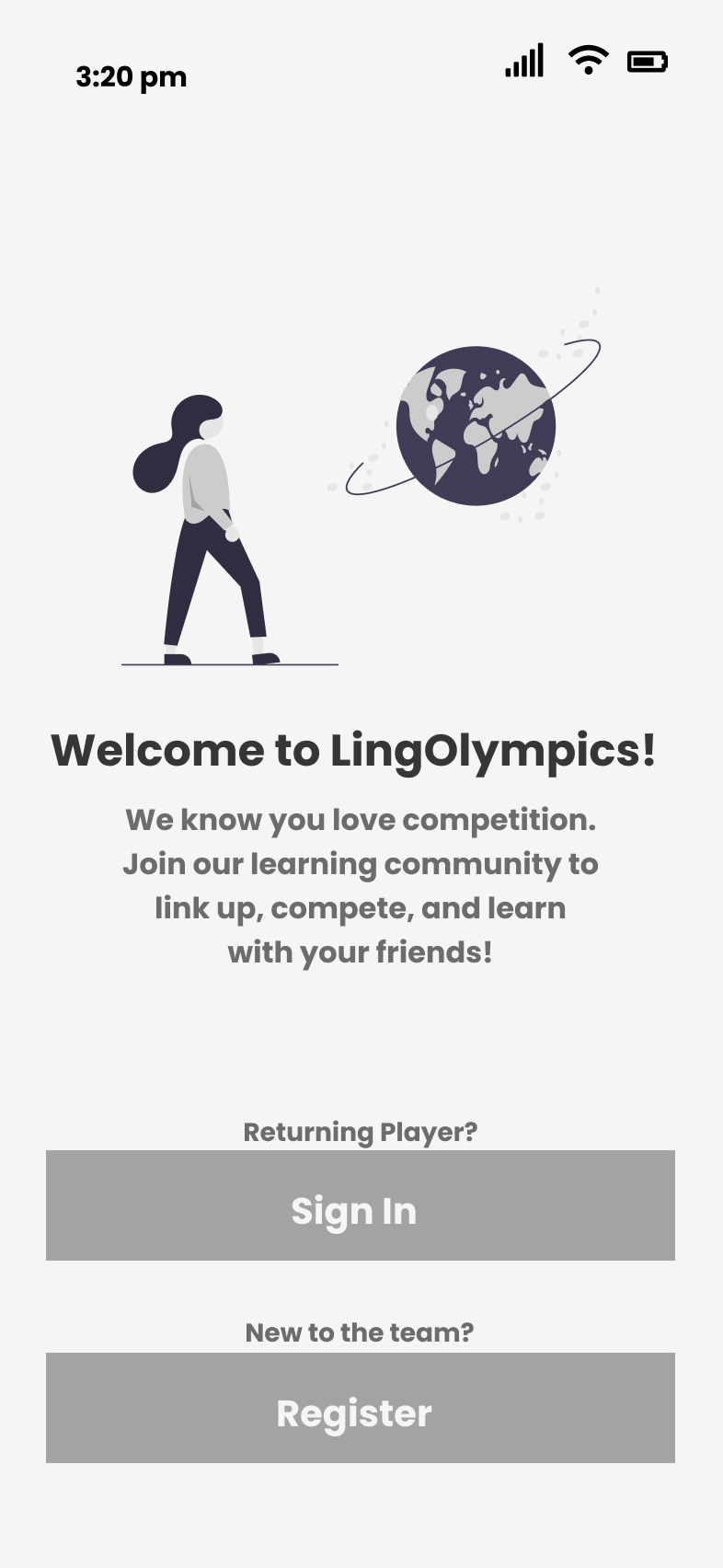
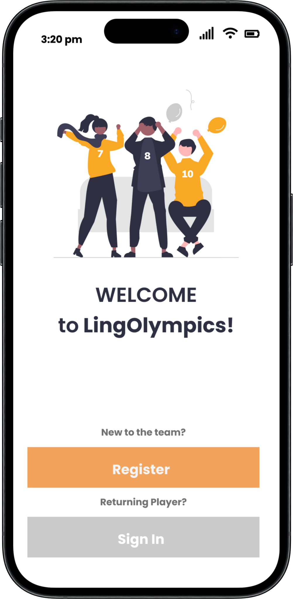
My Fitness Pal

"MyFitnessPal is a popular fitness app that has been around for over a decade, and it has gained a significant following in the fitness community."
Read more
0 %
Of Users said like more gamified ways of learning.
0 %

Of Users expressed they have tried learning a new language in the last year.

0 %

Of Users stated they need a learning app to reward and motivate them.

Persona

“ I didn’t expect I would need to communicate to my customers at work in other languages! The new area where I moved has a lot of young bilinguals, and I want to be comfortable communicating with them. I like virtual learning but it’s easy for me to get bored”

Roberto

Design Process

I began the design process with an in depth analysis of market competitors and pin pointing the major problems to address. After completing the V1 prototype and usability testing, V2 involved adding the necessary revisions with an additional UI update, making Lingo Lympics a user tested prototype driven by finding solutions. 

Growth and Improvements

Below are examples of key revisions made from the first Lo-fi wireframes, V1 and lastly V2. Interviews, market research, collaboration with mentors and colleagues, are a few of the contributing elements to the newest iterations of my design.

Participants

  • Ages 22-58
  • Family size 0-4
  • Occupations:
    • Homemaker
    • Student
    • Therapist
    • Web Developer

Methodology

  • Live Moderated Usability Tests
  • 10-15 minutes sessions
  •  Tasks to Complete:
    1.  Onboarding and inviting friends
    2. Locating saved friends and making changes
    3. Invite 3 named friends and play a game with them.
    4. Play a game solo.

Questions

  • Will my users be able to navigate to all the features successfully?
  • What will the users feel when trying to complete the tasks, what frustrations or points of excitement will they encounter?

Results - Top 3 Revisions

Based off of the Jakob Neilson Scale the following were the highest needed revisions:

  1. Making the scrollability and overall navigation of the page more accessible and obvious to users.
  2. Adding more engaging interactions to the features.
  3. Improving the landing page tutorial slider to help users understand the apps purpose and use.

Improvements Driven by Testing Data and Feedback

These revisions scored the highest severity from user testing. Some of these were revised twice, originally in Version 1 and later in Version 2 after a UI redesign.

Landing Page V1

The original landing page had little animation and the text was lengthy and not as direct informing the user about the app.
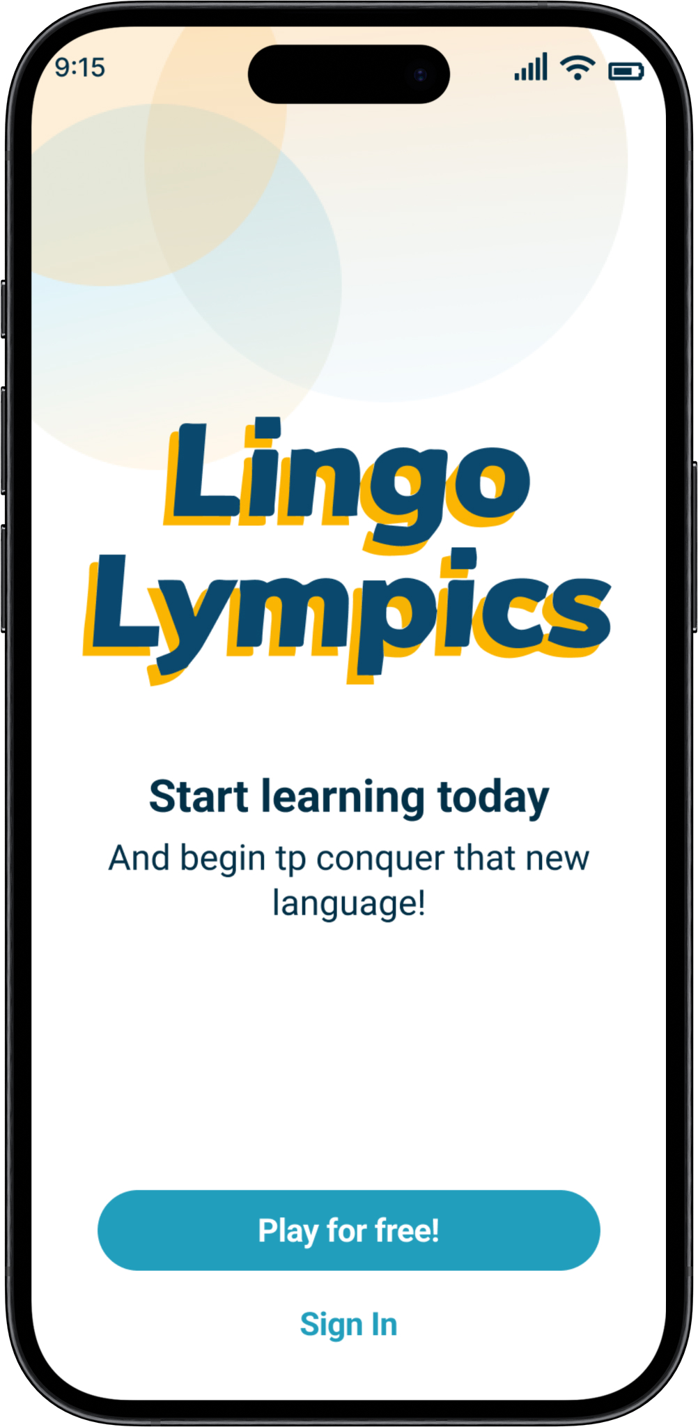
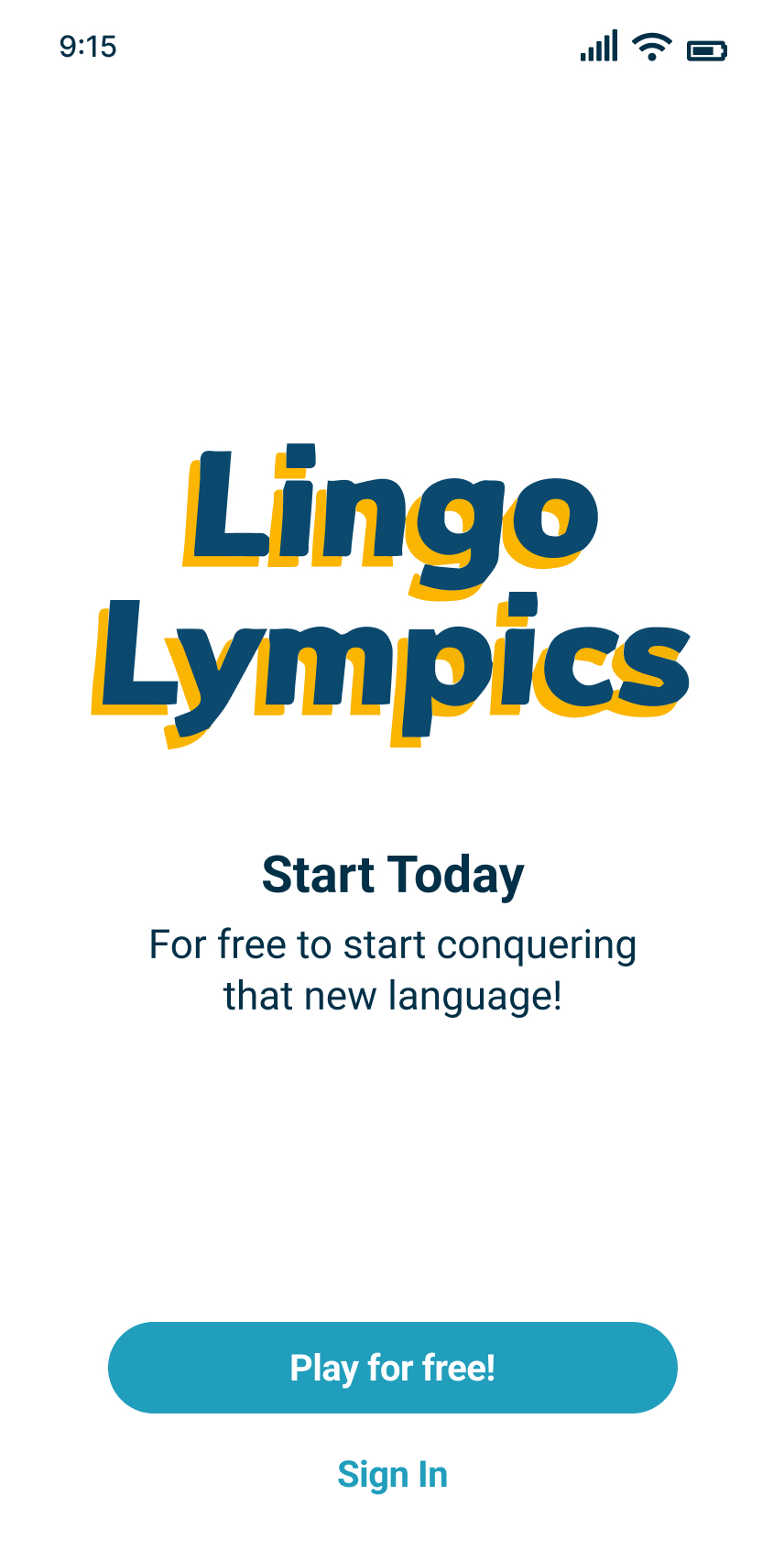
Landing Page V2

V2 includes more informative sliders, Branding with Logos and updated color pallet.
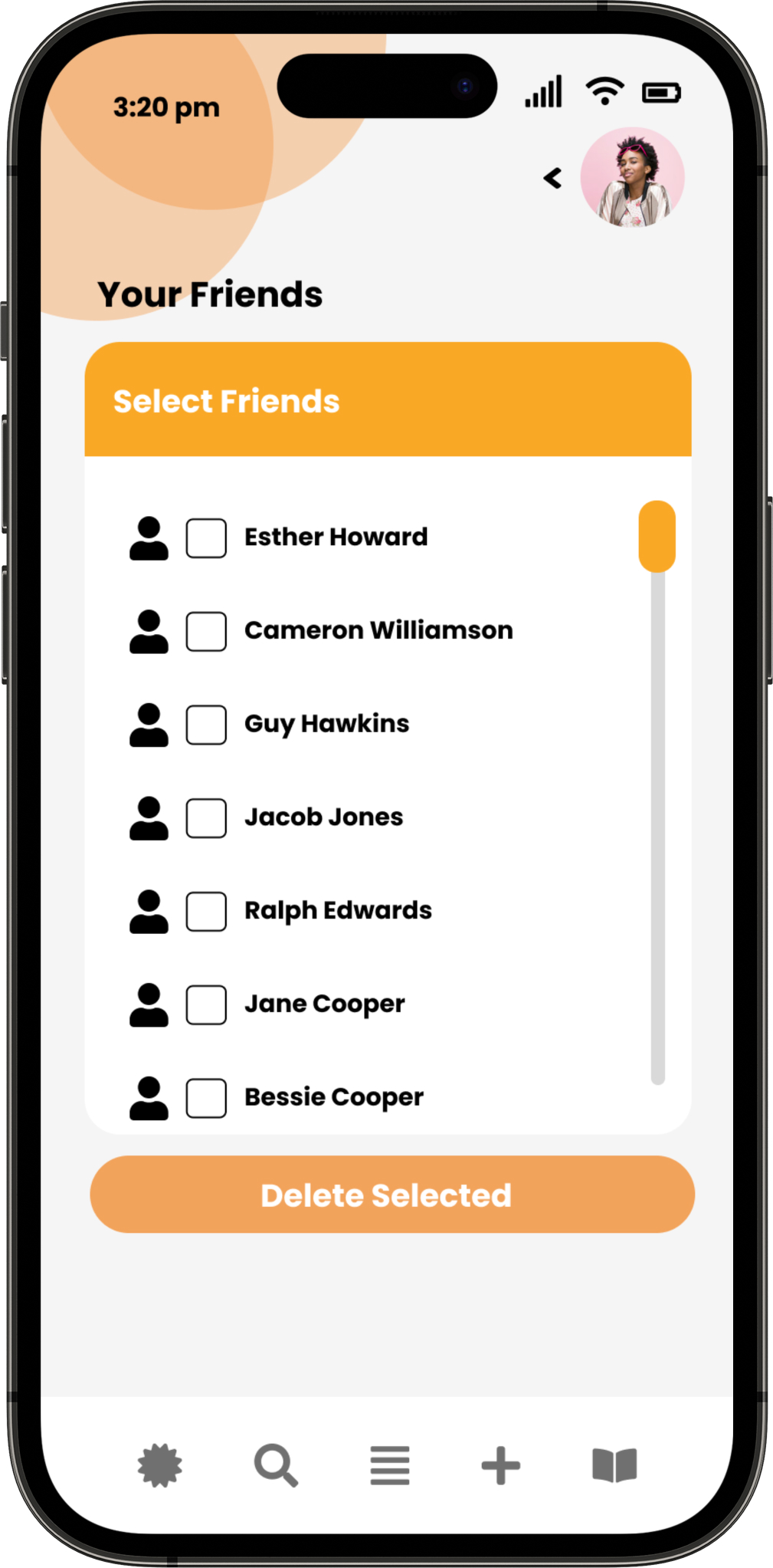
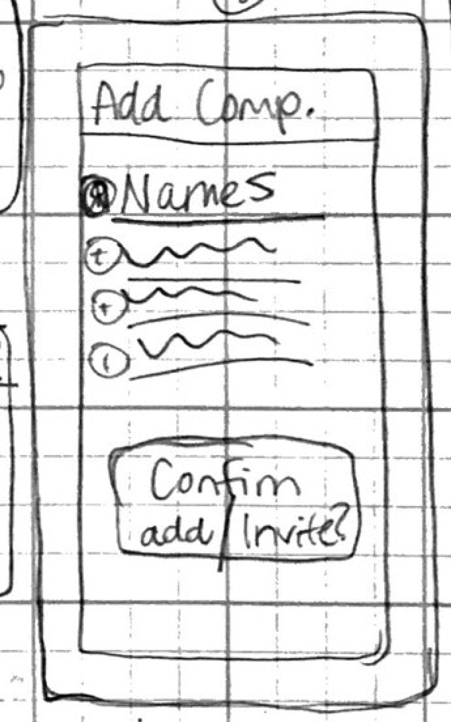
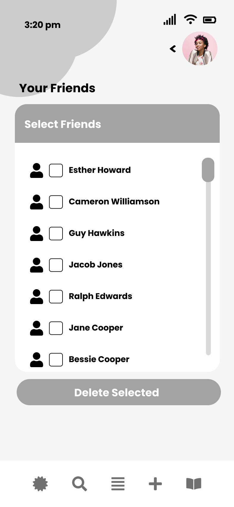
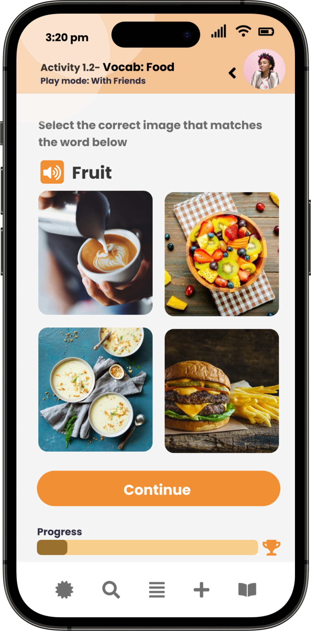
Friends List V1

Friend profiles were generic and the format of the container did not use screen space sufficiently. The scroll prototype was unnecessary.
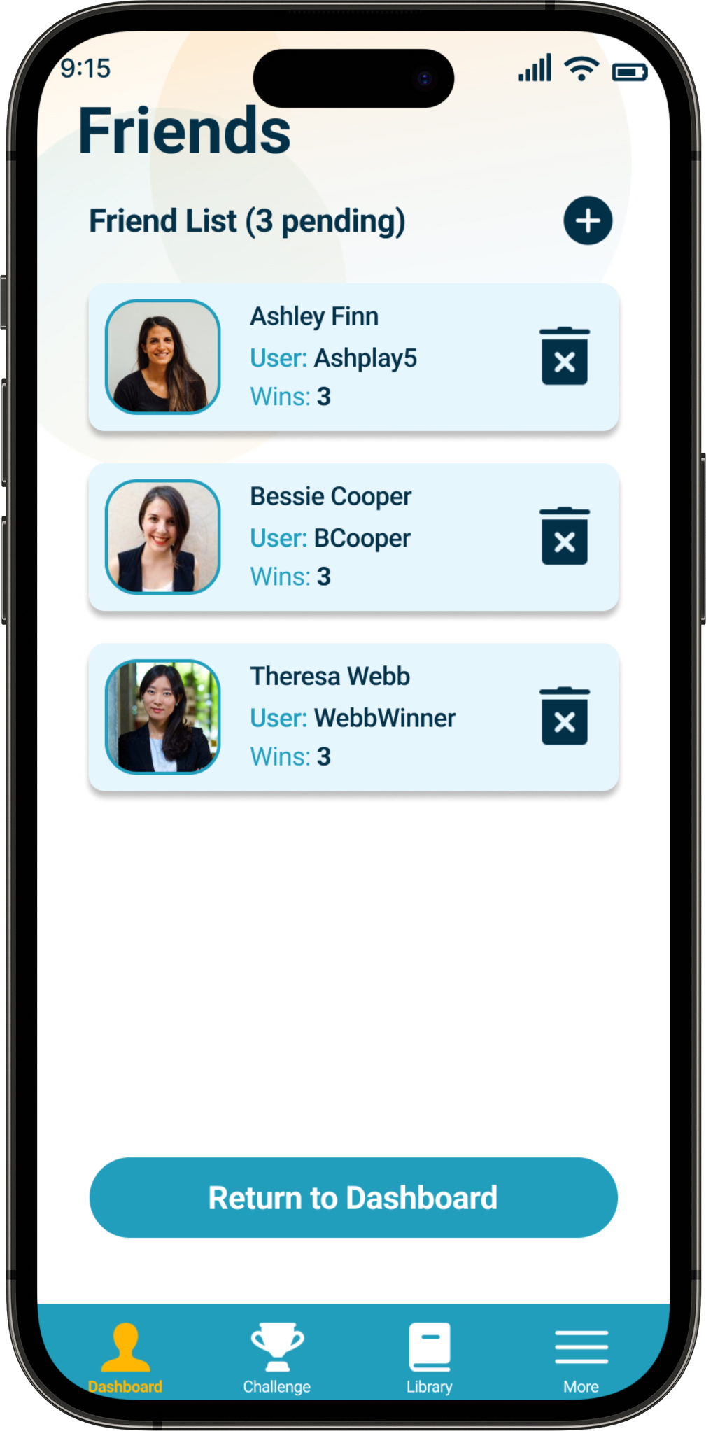
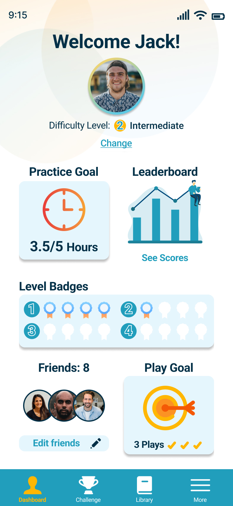
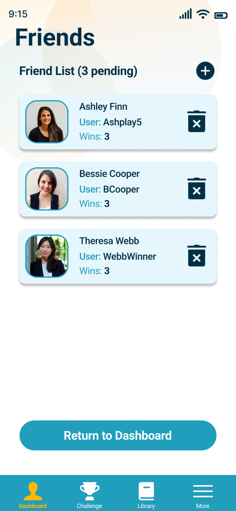
Friends List V2

V2 had updated friend profiles and offered users more freedom to edit their list and see pending invites.

Challenge V1

Accessibility of imagery and text was poor and use of white space was not effective.
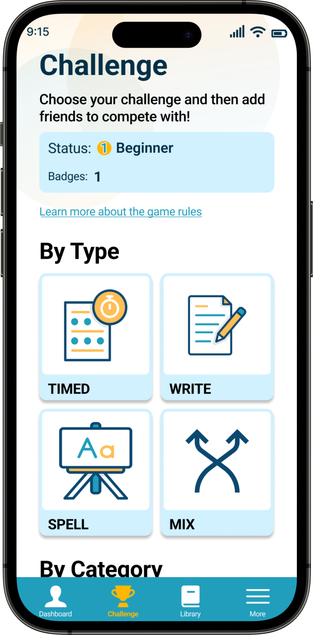
Challenge Page V2

V2 offers a clearer organization system, better accessibility with updated text and imagery for subjects.

Solutions

These solutions relate to the original problem of our persona and satisfy the gaps in usability that participants faced in testing. These solutions improve the app and align with the original goals.

A More Usable Dashboard

75% of participants expressed their want to track and see progress when learning. In V2 information is not only more accessible but richer in purpose

Tasks in Video:

  1. Setting Difficulty
  2. Practice Time Goal
  3. Badge Goal
  4. Adding Friends

Differentiated Types of Learning

Participant as well as market data reflects that no user learns the same. In my V2 I added separate “Solo” learning opportunities in the form of flashcards and a Word Library.

Stronger Motivation

100% of participants expressed their need for apps to give strong motivation when learning. After V1 testing I focused in on quotes and observations to improve the positive feedback given to users when playing, and offering “correct” as well as “incorrect” toasts.

Style Guide

Designing 2 Versions of this prototype required constant maintenance of a Design System. From V1 to V2, Branding, Components and UI elements had to be organized and updated .

The Prototype

View the mobile task flow here in FIGMA.

Documents Page

On mobile and desktop users have the ability to upload medical and health related documents securely.  

After studying Google Material Design and leading drive applications I re-designed this page for improved usability.

Mobile Spalsh Screen:

After feedback and testing, I listened to colleagues, and greatly improved the slide tutorial page for mobile. 

With greater accessibility, the information conveys to every type of use what exact products the app has to offer.

Find Care Search

On mobile and desktop users have three main search filters to find care. Due to the growing popularity of virtual visits, this search field was added after research and user testing.

Find Providers:

After collaborating with colleagues, and usability testing I optimized how users choose a provider. “Distance” information was added, and also better accessibility for visually impaired users with padding and updated UI styling elements.

Notification Settings:

After participant feedback and testing this page was created to give users the freedom to choose notifications for receiving text and or email updates such as appointments or new information published to the app.